What will they look like?
  • 390 posts
  • Page 4 of 26
Thorpe wrote:
"commissioned officer" ... one that goes in as a officer when they joined...they normal been to college before they en-listed.

"en-listed officer" ... one that either went to collage after they en-listed or was given the rank by outstanding service.

I think this is what the difference.
95.5% of the time you kill a players cap before your 2nd turn in... you fail or die next
The_Bishop wrote:
Rather than start a new thread, I prefer to continue this old one, where several people expressed their opinions when the white ranks came in place. Even if the premium ranks are better done compared to non-premiums, still I think black is a much nicer colour for ranks compared to white.

Plus I think Generals should stay more noticeable from the other Officer ranks. Especially 2nd Lieutenant and Brigadier General are so similar that sometimes really I find hard to distinguish them.

Basically I think Generals deserve starts more than red stripes. So I tried some different layouts with multiple stars, and some other very similar to the current, just giving golden dots to Generals and some other minor changes.
In the army usually the more chevrons, stripes or stars one has the more his rank is high. So the Dominator rank as it is now seems to be something less than Brigadier. If you want the single star then at least should be a special star, owned by the Dominator only.

So here it's my proposal with 4 different layouts.
Red stripes and golden insignias for premiums, grey and silver for non-premiums.
A-B-C-D layouts (click to show)
Some ranks have got the same image for premiums and non-premiums, but they will be very well recognizable, just using different frames. And even more with a different background colour, but I don't know if it is the case. So I tried grey-metallic frame for non-premiums and a shiny blue for premiums. Also other colours, but blue seemed the one looking better.

Frames (click to show)
As I know there is a lot of work in progress in these days then maybe it's the right moment to care about reforming the rank icons.
«God doesn't play dice with the World» ~ Albert Einstein
PsymonStark wrote:
Of what you propose, my favourites are A & C because it's not a bunch of stars. It looks more real in my opinion.

I miss badges in navy blue and navy green, and wouldn't really ditch the white ranks, but less flashy no golden contours and silver features, or golden too. But really like a lot those red badges. The ones in blue are again a bit too flashy in my opinion.

I would try and change things but it would need to wait a couple of weeks.
Living proof that everyone can be a brilliant great good decent cartographer.
Matty wrote:
Some random thoughts:
- Personally I think the borders around it, especially the blue ones, look terribly ugly, sorry.
- Why haven't you used the white badges anywhere to compare with what we have now?
- Adding new rank colours is really easy, and doesn't nescessarily have to be done now.
- I really like the silver and gold versions of the rank differences, but there isn't much difference between premium and non premium badges in the lower tiers.
- I think your gold is a bit too white/pale. The gold on the current white badges looks better I think.
- We might want purple badges with sparkles, to match Syg's undies.
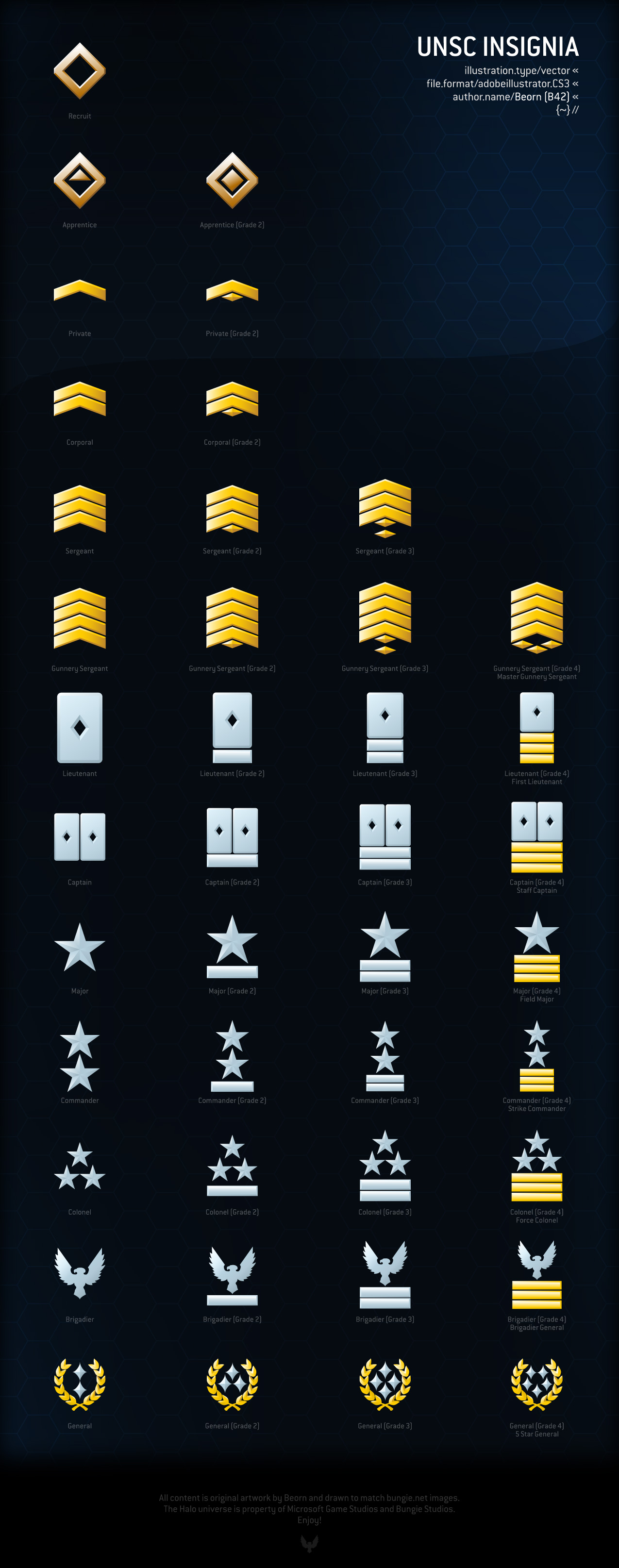
- Usually when I see an eagle insignia, the wings are up, not down. If you are changing the badges anyway, why not change that one too (I personly really don't like our current colonel badges).
- For as far as the ABCD layouts go, the ones with less starts look better, so I'd order them A C B D (I like A best).
- From all the insignia's we currently have, I think the dominator looks best and then warrant officer. I think the simplicity of the dominator rank makes it look ALOT better than the general ranks.
- Not so much a fan of the red ranks as they are now.

So yeah, I'm a bit negative about it now, sorry. Still, I think it's a good thing to think about replacing the ranks as we have them now.

Edit: If you look at these they have three really small stars. Maybe that's an idea?
"Strength doesn't lie in numbers, strength doesn't lie in wealth. Strength lies in nights of peaceful slumbers." ~Maria
PsymonStark wrote:
I believe there should be a sufficient amount of colours and versions. Not all of them will be liked by everyone, but offer a wide range
Living proof that everyone can be a brilliant great good decent cartographer.
The_Bishop wrote:
Matty, I had no image of the premium ranks listed together, that's why I only put the non-premiums. And yes maybe the eagle can be better. I didn't redo anything of the insignias, only played a bit with colours and contrasts.

Psymon, yes I have to admit a bit too flashy all together, but maybe one by one is different. Anyway when you want I can send you the file if you wish to adjust things.
«God doesn't play dice with the World» ~ Albert Einstein
PsymonStark wrote:
I would adventure that frames which are neither white, black, golden and silver won't look realistic.

Another thing, what about diverting ranks when getting to officer level? I mean, different badges for army, navy, air forces...
Living proof that everyone can be a brilliant great good decent cartographer.
The_Bishop wrote:
Then I produced an image adding the current premium ranks for comaprison.

You see Matty? My gold is much more shiny! Like real gold is.

Rank proposal (click to show)
For one that want to see the details, I moved the red/grey stripe lines OVER the frames. They look better in my opinion, it gives more 3D effect (compare to previous image). The overlay in fact is just 1 pixel, so it is not very noticeable, but still it makes a significant change. Also tried a darker blue frame.

The red version is cool but I'm not sure it is suitable, imagine to have many rank icons on a page, all red,,, I don't know. Anyway it's the D12 red.
«God doesn't play dice with the World» ~ Albert Einstein
Matty wrote:
The old ranks look a bit more like icons. Less shiney, less glitter, less glamour, less ... everything.

But there is a saying that less is more. Simplicity is a good thing. Your new icons look very busy and cluttered. I think that's what was bothering me a bit.

So for now my question wouls be, what happends if you have no border for the non premium versions. Have a dim gold border (like the white badges) for the officer premium ranks and a dim silver border for the other premium ranks?

Btw, I think I like the touch of the stripes on the ranks. The more pale/darker red looks a bit weird on the black badges. Pale/dark looks good on the white badges, but on the black badges the bit more colourful red stripes look better IMO.
"Strength doesn't lie in numbers, strength doesn't lie in wealth. Strength lies in nights of peaceful slumbers." ~Maria
aeronautic wrote:
I always wondered why they didn't just highlight the black rank badges for premiums.

I would say the gold outline currently on premium ranks should at least be tried on the black ranks.
Hyd yn oed er fy mod Cymraeg , dim ond yn siarad Saesneg, felly yr wyf yn gobeithio y bydd y cyfieithu yn gywir.
Cireon wrote:
aeronautic - Nov 19, 12:02 PM
I would say the gold outline currently on premium ranks should at least be tried on the black ranks.
This this this this this please!

I tried doing it myself, but I couldn't get it working because I am not a photoshopper.
“This is how humans are: We question all our beliefs, except for the ones that we really believe in, and those we never think to question.”
- Speaker for the Dead, O.S. Card