What will they look like?
  • 390 posts
  • Page 9 of 26
Matty wrote:
Summary of suggestions:
1. His Eminence's first proposal (I like the idea of the colour scheme of 1 and 2): click.
2. Matty's proposal about new ranks (a bit improved by His Eminence, although I'm not a fan of the 4 small stars): click.
3. Aero's best proposal so far (IMO): click.

There are more, but I think these three are the best so far.

-------------------------------------------------------
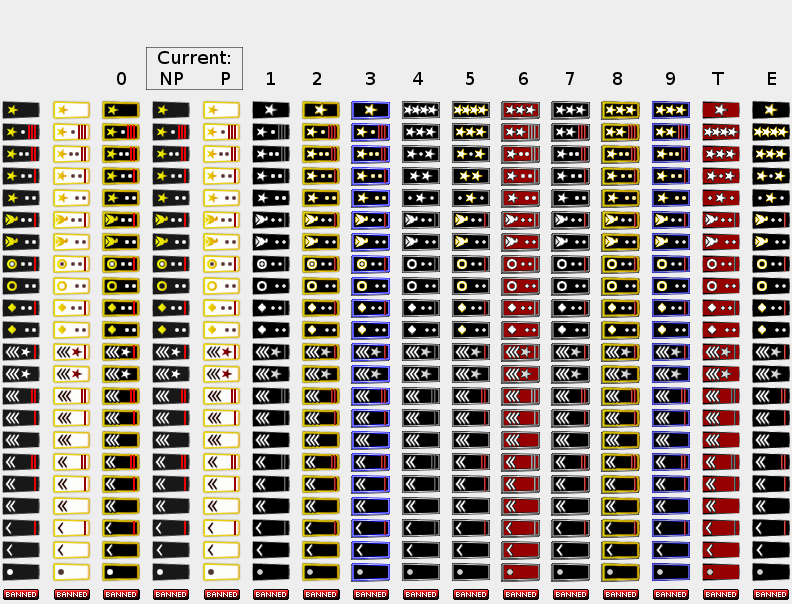
My remark at suggestion 3:
Sorry, bit skeptical about these.

Personally I like stars better than crowns. The old dominator orank and the old warrant officer ranks are amoung the best of them. They now are, kinda, well, they sort of look ok, but not a huge fan.

The grey and gold combination doesn't look that good either.

I defenitely think that the current yellow could be a bit darker (golder), but I think you have gone a bit too far with it.

Not a fan of the feet of the eagles, I liked the eagles of His Eminence.

I like the three star general, but it makes the dominator looks worse. Why is brigadier no longer a general?
Also, the logic of the red bars is flawed with the general ranks. It used to be a rank with and a rank without a red bar. No longer so.

I think your dots at the right side can be placed a little bit closer to each other. I like it that you fixed the offset issue they had.

I really like what you did with the semi circles on the lower ranks, although I do like the old warrant officers better.
The warrant officer ranks are kind of the passing point for a lot of players. I don't think we should have three of them.

Very much unsure what you've done with the captain and major. Doesn't look logical to me at all.


I really like the single star for the dominator rank.
Why not try (two and three small stars) together with (a single red bar or not) for the 4 general ranks (and of course two white dots).

Edit: Maybe we can go for just three general ranks? Then we can go for the 1-2-3 star generals, without the weird conflicting bars and dots. Unless we can fit 4 stars on one badge.
"Strength doesn't lie in numbers, strength doesn't lie in wealth. Strength lies in nights of peaceful slumbers." ~Maria
emjaydee wrote:
I don't actually think any of them are an improvement on the current badges. They all look a bit 'cheap' to me.
The_Bishop wrote:
Still I am thinking at something like this:

Examples (click to show)
Complete List (click to show)
Rustic but efficient in my opinion.

«God doesn't play dice with the World» ~ Albert Einstein
supiachao wrote:
I agree with Hoodlum that the gold and white rank look very nice, and it is something cool about the premium members, look clean and neat.

I actually prefer the current colour scheme instead of the proposed ones.

The proposed badge changes is nice, I like how it ranked up like from 1 star to 2 stars to 3 stars. Because the current one is kinda confusing, like 1 stripe more or 1 dot less thingy is confusing.

Like that birdie changes, it used to look like a rose sideway to me until people tell me it is a birdie. (yea, no military background, that is what I see) Now the new one really look like a birdie.

My favourite is the major upgrade, that dot is kinda awkward, in the premium it reminds me of the alien field mark.

How about use the current colour scheme with the new badge? I think it will look better, without the framing. The framing look a bit weird to me.
I think that might solve the looking cheap problem.

Another question is, is the current red in the premium rank same as the red in the non premium rank? It doesn't look as bright in white background than in black.

How about gold and white for premium, and blue and black for non premium?
Spoiler (click to show)
Vexer wrote:
Although I think aero's ranks look more professional and neat I like the bishops latest proposal the best. The crowns on Aero's are too fancy for me and too different from what I have been used to for the last 5 years. My wish would be for aero to use his skill to redo the bishop's latest proposal to make them look more polished. The star on the warrant officer ranks looks too grey. I would rather it matched the star for the general ranks.

I think there might be some that would like to keep the white ranks. Perhaps a white version could be made as an option but the black with gold outline the default.
The_Bishop wrote:
@Supia, gold/white and blue/black remind me a web famous dressing photo... :)

@Vexer
Surely Aero's graphic skills are uncomparable to mine. I would be very happy if he can adjust my work, not sure he would be happy too though, I hope so.
I can sort the layers and send the file to someone with better graphic skills than mine: Aero, or also Psymon if he wants, as I remember him offering his help.

I agree that is better to keep the ranks as they are, I mean rank names and graphic symbols. They simply are very easy to recognize and understand, and we all are used to them, as pointed by Vexer. I don't think we need to copy them from any real country armies, it would only make it more confusing and more biased.

The only small changes that I applied on the ranks are:
- Changed the eagle following Matty's suggestion. Others also referred the current eagle not being very good. Complex symbols like eagles only overcomplicate things at that size, since I wouldn't add any others and I think the eagle shouldn't hold anything in its legs.
- Slightly enlarged and goldened Generals' buttons for more ease to distinguish them from 1st and 2nd lieutenant.
- Slightly narrowed and darkened Commissioned Officers' buttons for the same purpose. All dots in ranks without red bar are also moved a couple of pixels for not staying too close to the frame.
- Removed the Major's 3rd buttons that didn't seem very logical to me (debatable if you want)
- Given 2 stars to the (maximum) General. It seemed deserved to me. One bar more and one dot less didn't seem enough for distinguishing the maximum rank from all the others that are lower.
- Given 3 stars to the Dominator ranks. This is a delicate point since I know Matty expressely asked to keep the Dominator as it is now. But Aero and I found it having a demotion look compared to Br.Gen. or Mj.Gen. Then the solution would be to change all the Generals' ranks in order to keep the Dominator's as it is. Well, we tryed but it seemed to me not worth, then I believe 3 stars have a nice look too. Plus, as pointed also by Supia, they logically complete the sequence 1 star, 2 stars and 3 stars: 1 is for "aspiring" Generals, 2 are for "true" Generals and 3 are for the Dominator only.

Well, it seems a long list but they all are very small changes and details.

Other graphical features:
- Added a light effect on the right part of the red bars giving them a bit of solid look.
- Turned the W.O. into a slightly greyish colour to keep them less bright compared to the Generals' stars. Probably this way they are less beautiful, but it was my intention to make the higher ranks to look more beautiful and more shiny comapred to the lower. It is for answering to Vexer, but I don't know if he agrees to intentionlly make them less beautiful for the mentioned purpose.
- Created (without intention really) metal feeling frames, I think they are cool but probably they need to be retouched. I tryed to play with colours and they didn't look good with a light colour as white-grey or yellow-gold (since it makes the icons to look like they are smaller) unless they get a dark tiny out-line, just faint. A dropping shadow solves the issue even better and gives to the frame a solid look; I added it for premium's only and left the non-premium's without shadow like they are flat: actually it's a distinction more between the two types.

The problem with the frames is that they raise the size of the icons some more pixels. But I don't know if it really is a problem.
«God doesn't play dice with the World» ~ Albert Einstein
cbt711 wrote:
Why not have white backed and black backed premium ranks with gold outlines like Bishop's latest, and one of the benefits to premium is choosing which one you want.

Or buying either with tokens, so there's something else to spend tokens on. Ideally it would be great to have white backed, black backed, olive backed, and navy blue backed. In the US marines are Olive, or other countries, the army is olive. Dark / Navy blue for navy and air force fans. Would be really simple, just change the color of the background.

Also, how have the major's ranks made it so far? It's just a circle! I do really like Aero's version of captain major lt colonel and colonel. Everything else I like Bishop's.
The_Bishop wrote:
Yes Cbt, the idea is to have black as the default, with golden frame for premiums, plus the option for them to chose white background insteaad of black.

Why I prefer the circle to the crown?
Well basically they are just icons, just symbols, not real ranks, nor even wanted to be realistic, just practical. Plus they all are rotated 90° degrees, so those geometric symbols like circles, squares/diamonds and stars eventually got a better look compared to eagles and crowns which are a bit weird in that position.

Then the old eagle seemed a lily flower, as the new one seems an anvil and the crown seems pretty much like a skull. Detailed images are not good there, unless you triplicate the size... then it works, but the task was to create icons. They are forced in my opinion to be not realistic, but just a sort of caricature parody of what real ranks are.
«God doesn't play dice with the World» ~ Albert Einstein
PsymonStark wrote:
I agree with cbt for a bigger choice for premium (4/5 choices, not more, black white, olive, navy blue...). Shouldn't be hard and people usually like having a variety.
Living proof that everyone can be a brilliant great good decent cartographer.
The_Bishop wrote:
Well, the colours proposed by Cbt can be added for me, they all have a military look.
And also the proposal to give them a cost in tokens might be good.
I just don't want things like purple orange and green that seems to much like a carnival to me.

I see the greater flaw of my last version is that dark pixel on the frame corners.
I don't know, do you want me to try to adjust it?
«God doesn't play dice with the World» ~ Albert Einstein
aeronautic wrote:
Don't bother adjusting any graphics Bishop, just wait until I have made them how it has been suggested and we can adjust / modify everything from there.

I should get time to do them either tomorrow or Wednesday.
Hyd yn oed er fy mod Cymraeg , dim ond yn siarad Saesneg, felly yr wyf yn gobeithio y bydd y cyfieithu yn gywir.
PsymonStark wrote:
Lol, purple ranks, no, never proposed that... :D
Living proof that everyone can be a brilliant great good decent cartographer.
aeronautic wrote:
I made the ranks as suggested by The_Bishop but refined the symmetry and colours and they stick quite closely to the original format & colours.
I have not made other optional background colour versions until the ranks & layout are accepted.
The_Bishop's Latest Suggestion (click to show)
Player Ranks Demo 5 (click to show)

I have a suggestion about re-labelling some of the lower ranks, because 1 stripe is mostly a Lance Corporal and 2 stripes are mostly a Corporal.

2 Stripes + 2 Bars = Master Corporal
2 Stripes + 1 Bar = Command Corporal
2 Stripes = Corporal
1 Stripe + 1 Bar = Command Lance Corporal
1 Stripe = Lance Corporal
Dot = Private

This will also be more in keeping with the current advancement structure.
Hyd yn oed er fy mod Cymraeg , dim ond yn siarad Saesneg, felly yr wyf yn gobeithio y bydd y cyfieithu yn gywir.
Vexer wrote:
Looks perfect to me.

I'm all for getting rid of the basic rank. I always hated it.