
- Mark as unread from here
- Posted: 11 years ago
- Modified: 10 years ago
-
Post #91
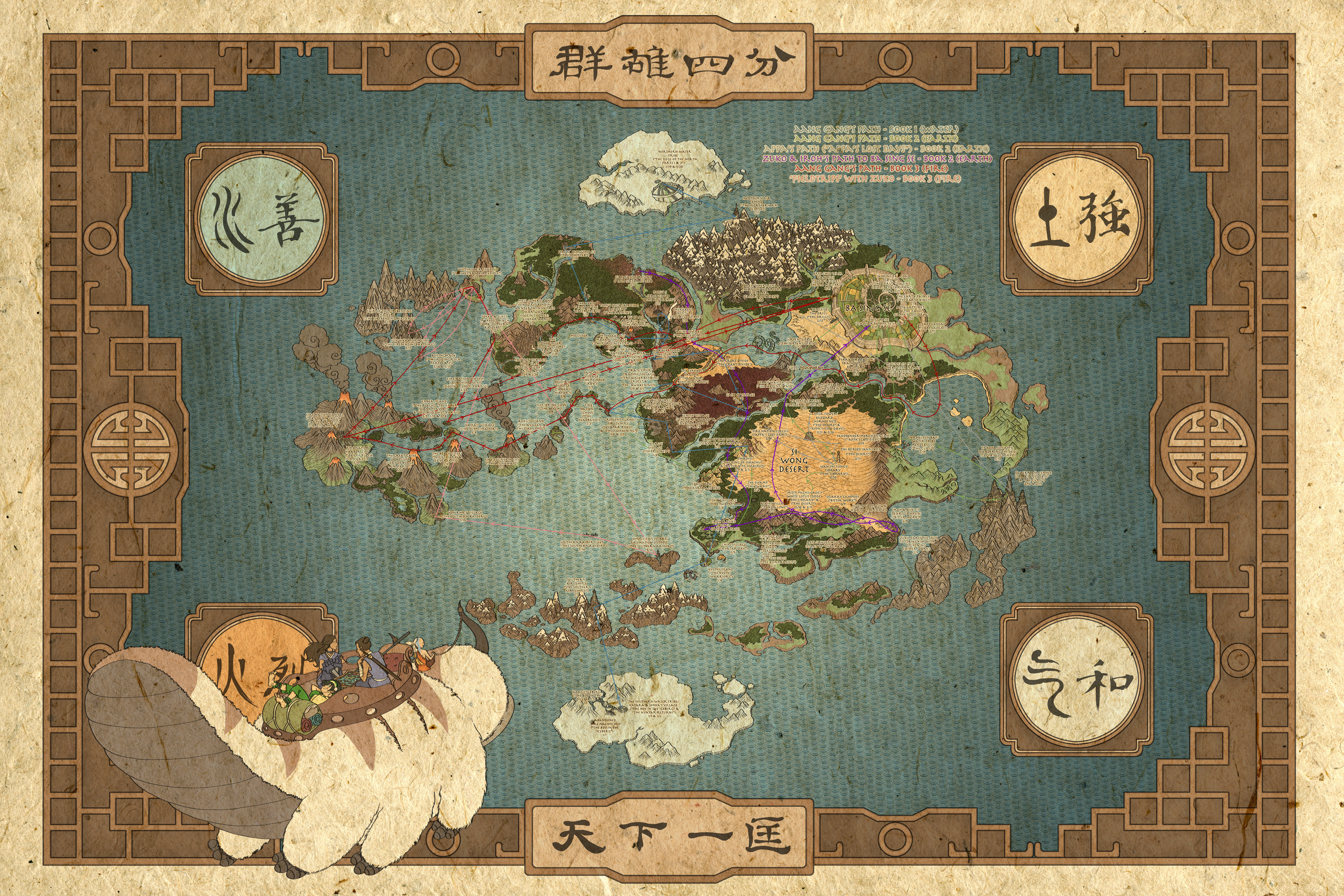
Here is the newest iteration
I've tried it, and I'm not a fan.
I was VERY influenced by the third map, a lot of the names are even from there.
In fact, Lightning Peak is named after the description of that island on the map, "Zuko dares the skies to strike him with lightening."
When it comes to the first map, I love the amount of detail when it comes to towns, and region names. However, I have ZERO idea where most of the names come from. Neither the shows, DVD/BLU audio commentaries (a very useful source), comics, nor video games have ever been to or named the island next to Republic City. For that reason, I prefer to use the official names of a location, region, or city even if they're not 100% accurate. No, that island is way too large to be Air Temple Island or Aang Memorial Island, however any fan will easily recognize those names as an island in that exact region. In the case of territories like Lightening Peak, I've made up a name based on events that have happened in that region.
I'm using one of the textures you've provided.
The dotted lines are gone. They're now the curved arrowed lines like before. However, I've tried to tone them down.
v.11 - new textures, removal of dotted line, new territory name (click to show)
![[image]](http://www.bluemelon.com/photo/5415561.jpg)
naathim - Mar 18, 01:59 AM
If aaron and star have the technical abilities I'd love to see mountains/volcanoes like in the opening sequence from the show: https://www.youtube.com/watch?v=pJUgCzEdx9k
PsymonStark - Mar 18, 12:44 AM
According to the map that aero posted, the new territory should be called Zhengfu or Zhengfu Island. That would get rid of the possible confusion created by Air Temple Island.
In fact, Lightning Peak is named after the description of that island on the map, "Zuko dares the skies to strike him with lightening."
When it comes to the first map, I love the amount of detail when it comes to towns, and region names. However, I have ZERO idea where most of the names come from. Neither the shows, DVD/BLU audio commentaries (a very useful source), comics, nor video games have ever been to or named the island next to Republic City. For that reason, I prefer to use the official names of a location, region, or city even if they're not 100% accurate. No, that island is way too large to be Air Temple Island or Aang Memorial Island, however any fan will easily recognize those names as an island in that exact region. In the case of territories like Lightening Peak, I've made up a name based on events that have happened in that region.
aeronautic - Mar 18, 12:25 AM
Land Texture:
Although I know nothing about the Avatar or Korra series, I have searched the official maps and even though they are a different format, being visual images rather than game maps, they show the true terrain, such as this one: http://i.imgur.com/rtoh22X.jpg
The only maps I can find online that are also flat and textureless are other people's versions of the map, which are really very basic, such as someones version of a Political Map: http://loudo.deviantart.com/art/World-of-Avatar-Political-Map-Legend-of-Korra-442568439. Other official maps are normally 3D artistic maps like this: http://farm9.staticflickr.com/8351/8306408148_056c8149c4_o.jpg
Therefore, I have to disagree with not putting any more texture to the land map, it is too flat and needs a bit of substance. The texture doesn't have to be the true terrain, that would be unsuitable too, it just needs to be a representation that the land has substance.
In case you are having trouble finding a suitable texture, I have made a couple for you in Greyscale that might be of use, where you can put one that you choose above / below or above & below your land and reduce opacity to suit, compensating with land colour saturation, brightness, contrast etc (sized to the whole map, just delete all the parts not on the land).
You don't have to use these, but I won't make a request without at least trying to assist.
Dotted Lines & Arrows:
The mix of the two I feel is unnecessary and confusing. I think you should choose one or the other and use it throughout. Also, if you use dotted/dashed connection lines, they don't have to go over the land at all, they can pass behind it as long as they link each section of land to the next required, this way they don't dominate the land, or hinder the easy viewing of Circles & Labels that need their own clear space. The arrows seemed to work for all the advisers, perhaps it would be best to stick to these?! You have also used straight line connections for dotted lines and all curves for the arrows, again a mismatch and your curved arrows seemed to be a preference of the advisers.
Although I know nothing about the Avatar or Korra series, I have searched the official maps and even though they are a different format, being visual images rather than game maps, they show the true terrain, such as this one: http://i.imgur.com/rtoh22X.jpg
The only maps I can find online that are also flat and textureless are other people's versions of the map, which are really very basic, such as someones version of a Political Map: http://loudo.deviantart.com/art/World-of-Avatar-Political-Map-Legend-of-Korra-442568439. Other official maps are normally 3D artistic maps like this: http://farm9.staticflickr.com/8351/8306408148_056c8149c4_o.jpg
Therefore, I have to disagree with not putting any more texture to the land map, it is too flat and needs a bit of substance. The texture doesn't have to be the true terrain, that would be unsuitable too, it just needs to be a representation that the land has substance.
In case you are having trouble finding a suitable texture, I have made a couple for you in Greyscale that might be of use, where you can put one that you choose above / below or above & below your land and reduce opacity to suit, compensating with land colour saturation, brightness, contrast etc (sized to the whole map, just delete all the parts not on the land).
You don't have to use these, but I won't make a request without at least trying to assist.
Texture 1 (click to show)
![[image]](http://www.the-inkstore.co.uk/map_resources/Texture_Layer_Greyscale.png)
Texture 2 (click to show)
![[image]](http://www.the-inkstore.co.uk/map_resources/Texture_Layer_Greyscale2.png)
Example of land with texture (click to show)
![[image]](http://www.the-inkstore.co.uk/map_resources/Elements_1.png)
Dotted Lines & Arrows:
The mix of the two I feel is unnecessary and confusing. I think you should choose one or the other and use it throughout. Also, if you use dotted/dashed connection lines, they don't have to go over the land at all, they can pass behind it as long as they link each section of land to the next required, this way they don't dominate the land, or hinder the easy viewing of Circles & Labels that need their own clear space. The arrows seemed to work for all the advisers, perhaps it would be best to stick to these?! You have also used straight line connections for dotted lines and all curves for the arrows, again a mismatch and your curved arrows seemed to be a preference of the advisers.
The dotted lines are gone. They're now the curved arrowed lines like before. However, I've tried to tone them down.
Proud creator of the map Battle of the Elements
![[image]](http://www.bluemelon.com/photo/5416019.jpg)
![[image]](http://www.bluemelon.com/photo/5416536.jpg)
