• 344 posts
  • Page 17 of 23
Clarke wrote:
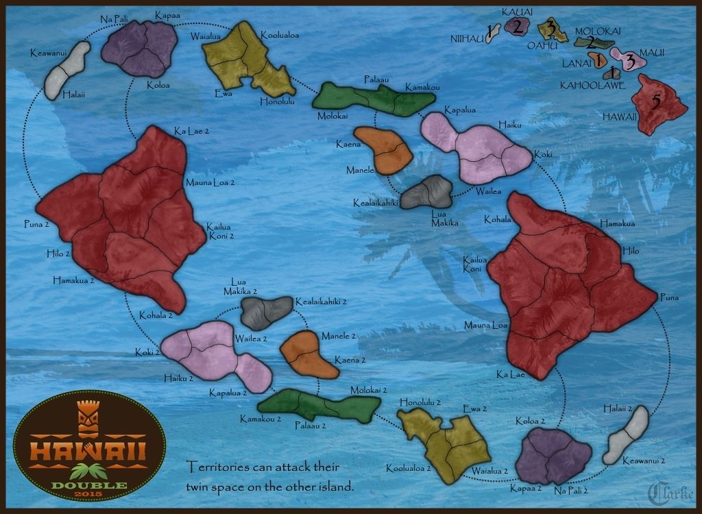
Here is the update. The following has been done:

1) The territory lines are the 1pt lines but with duplicate layering. Then I applied a 1pt gaussian blur to the lower of the 2 levels. I think it looks good.

2) I lightened the large red island, but ONLY the one on the right. I left the one the left untouched for comparison purposes. Have I lightened it up too much? not enough? just right? Once we are happy with it, duplicating the color on the other island would be quick and easy.

Once these 2 issues are resolved (territory lines and red island color) we will move on to the next topic, which is "connecting lines".

Spoiler (click to show)
Virtuosity98 wrote:
Looks good to me! :)
It is now Day 8. Please submit your Lynch vote, as well as any Role-specific Day actions you wish to perform (countdown).
Day Actions:
• #LYNCH [player], #NO LYNCH, #ABSTAIN in forum thread.
• Role-specific actions (via PM with V98).


aeronautic wrote:
I think you've got it, the vibrancy is about the same as the other islands now.
Hyd yn oed er fy mod Cymraeg , dim ond yn siarad Saesneg, felly yr wyf yn gobeithio y bydd y cyfieithu yn gywir.
Hoodlum wrote:
i like this a lot. colors, theme. the real landscape with the colors chosen make the island look like flowers.
It even looks like a "lei", how fitting.
Warrant ☰ ★Officer I and a Gentleman
The_Bishop wrote:
I agree, the new red is perfect, just a tiny bit less bright, but it makes the difference, getting it in equilibrium with the other colours... Aeronautic said it with vibrant words!

-----------

EDIT: As for the connecting lines I think I liked the curved style more or less as it was in the version at page 9:
http://i41.photobucket.com/albums/e277/Richard_B_Clarke/D12%20Maps/Hawaii%204.11_zpshhm2wu8z.jpg
«God doesn't play dice with the World» ~ Albert Einstein
Clarke wrote:
Okay I started drawing connecting lines. Here are 3 versions of the same lines.

Version A is a 1 point thin solid line with a 1 point gaussian blur applied.

Version B is a 2 point dotted line.

Version C is a 2 point dashed line.

Do we like any of these? I am cool with any of these three. I can make any of them thicker or thinner or in any color.

Please note: These are all drawn in pure black. However, once we pick a style, the final lines will be drawn in a gray that matches the territory lines on the islands. I should have done that originally, but I didn't think of it at the time.

A - THIN SOLID LINES
Spoiler (click to show)

B - DOTTED LINES
Spoiler (click to show)

C - DASHED LINES
Spoiler (click to show)
aeronautic wrote:
I like (B) the dotted lines the best, but not so dark.
Hyd yn oed er fy mod Cymraeg , dim ond yn siarad Saesneg, felly yr wyf yn gobeithio y bydd y cyfieithu yn gywir.
Matty wrote:
Right now I like (A) dashed best - but not so dark (:P I was going to say exactly that even if Aero wouldn't have posted).
"Strength doesn't lie in numbers, strength doesn't lie in wealth. Strength lies in nights of peaceful slumbers." ~Maria
Virtuosity98 wrote:
I agree with Matty - Version A looks best for me.
It is now Day 8. Please submit your Lynch vote, as well as any Role-specific Day actions you wish to perform (countdown).
Day Actions:
• #LYNCH [player], #NO LYNCH, #ABSTAIN in forum thread.
• Role-specific actions (via PM with V98).


Clarke wrote:
Matty>You said A dashed. But C is dashed and A is solid. Which did you mean? A or Dashed?
PsymonStark wrote:
I think he means he likes version A better now, subtler dashed better than A.

I think that A version is the best of the three, but could get better results with dashed with a not so black colour.
Living proof that everyone can be a brilliant great good decent cartographer.
Matty wrote:
Ehhhhh, I ment C - the dashed one.

Silly me.
"Strength doesn't lie in numbers, strength doesn't lie in wealth. Strength lies in nights of peaceful slumbers." ~Maria
Clarke wrote:
So Matty votes for C, Aero B, and Virtuosity A...

Glad we got that settled!!! Hopefully Vexer will settle the tie.
Matty wrote:
Which one do you prefer? I'd take that one.
"Strength doesn't lie in numbers, strength doesn't lie in wealth. Strength lies in nights of peaceful slumbers." ~Maria
aeronautic wrote:
I agree with Psymon, as I said "B", but not so dark... and the gaussian blur & colour you put on "A" would suit the dots or the dashes better, whichever one you choose.
Hyd yn oed er fy mod Cymraeg , dim ond yn siarad Saesneg, felly yr wyf yn gobeithio y bydd y cyfieithu yn gywir.