• 344 posts
  • Page 15 of 23
Clarke wrote:
REPOST: I am reposting my previous post here so you need not go back to previous page to see latest version. Previous post read:

Please take a look at this and advise if there has been a satisfactory reduction in glow to make this acceptable.

THANKS!

Spoiler (click to show)
Matty wrote:
The glow problem is solved. The map is bright, very bright, but not too bright I think. I like it.
"Strength doesn't lie in numbers, strength doesn't lie in wealth. Strength lies in nights of peaceful slumbers." ~Maria
Clarke wrote:
Great, so lets look at the next phase. Here are 2 versions of the "Territory Lines". I only did the North set of islands. Once we are happy with it I will double it to the southern islands.

The first version are what I call "JAGGED" lines. The second one is "SMOOTH" lines. You will see exactly what I mean once you look at them. I prefer the smooth lines. What do you all think? If you don't like either, what would you like to see differently?


JAGGED TERRITORY LINES
Spoiler (click to show)

SMOOTH TERRITORY LINES
Spoiler (click to show)

PsymonStark wrote:
I prefer the jagged ones as long as they correspond with any class of real local divisions. Otherwise, you chould find a middle way between them, because they look either too straight or too "artificial" with all those "predictable" zigzags. It's not easy to draw a realistic border.

Where possible, try to adapt the borders to the real ones (like this one for Hawaii). The perfect situation is when a native of the map zone can recognize the specific patterns in their borders.
Living proof that everyone can be a brilliant great good decent cartographer.
Clarke wrote:
Okay here is the update after having tried out Psymon's tip.

What do you all think? Can we live with this?

Spoiler (click to show)
aeronautic wrote:
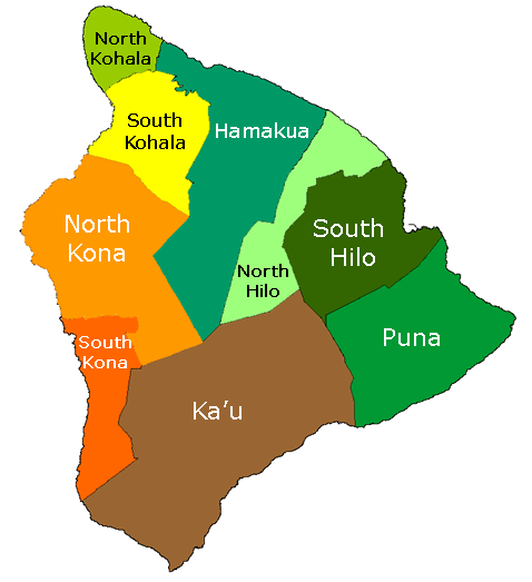
They don't seem right somehow. I assume you have followed the actual territory dividers of Hawaii, but they just don't look natural.

Before you change anything though, the dividers are not the same colour as the outline and this might make a difference, they look like pure black to me.
To make them the same, just select "Lock Transparency" on the dividers layer and select the solid colour of the outline, click on the colour selected and slide it to the left (greyscale) area of the colour screen, then spray the whole visible part of the layer. Only the lines will get sprayed and the colour should be a near black (dark grey). If they don't look the same, make the selected colour lighter or darker by tiny amounts until you feel they are the same. This should only take a few minutes in total.
Hyd yn oed er fy mod Cymraeg , dim ond yn siarad Saesneg, felly yr wyf yn gobeithio y bydd y cyfieithu yn gywir.
Clarke wrote:
the lines were drawn with an 80% dark gray (0=pure white 100=pure black) paint brush. Size 1 with 50% flow rate.

For the purple, red, and yellow islands I found actual maps with divisions. Purple is the 3 high school districts on the island. Red and yellow are the administrative districts of the islands with some slight tweaking.

I can change the line colors to a slightly lighter gray.

aeronautic wrote:
What I mean by "don't look natural" is territory lines tend to meander similar to rivers, where they go in a certain intended direction, but meander along the way.

Not all of course, but most do and natural boundaries are normally formed for a number of reasons, but mostly terrain & town/city/county boundaries such as Mountains/Mountain Ranges, Rivers, Forests etc. hence the mostly imperfect direction.

There are natural boundaries on the Red island.

The lines also look too thin, perhaps add a Gaussian Blur.
Hyd yn oed er fy mod Cymraeg , dim ond yn siarad Saesneg, felly yr wyf yn gobeithio y bydd y cyfieithu yn gywir.
naathim wrote:
Some of them do look a bit squiggly lol

Especially on the pink island. But I feel like that's getting a bit nitpicky.

BLUR THOSE LINES Clarke! You just might be sued by Marvin Gaye! LOL
Clarke wrote:
Psymon gave me some advice and showed a map which is very similar to the one I used to redraw the red island territories. He said using recognized borders would make people from that place happy if they happen to ever look at this map.

I'll give it another shot tomorrow to make the lines look more "natural".
Clarke wrote:
Okay I used a tip Aero gave me of duplicating my layers with the lines drawn on it to make the lines look thicker and darker. I think it looks awesome. Take a look and let me know what you think.

Oh and FYI - Since the 80% grey looked too much like black lines (previous comment by Aero) I drew these lines with 75% grey.

Spoiler (click to show)
naathim wrote:
I think this looks very nice! Although quite bright! The big red island especially is kind of painful to look at. You trying to blind us all Clarke? LOL

The dark lines and the subtle glow around the islands though, it does make it pop wonderfully. And the territory lines look much better now, not jagged at all!

All I could suggest would be pick a slightly less bright red for the main island.

Really wonderful!
Clarke wrote:
I appreciate the feedback Naathim. But we covered island colors weeks ago and the current colors are what the consensus of the community decided was best

I am glad you like the lines. I have been messing with them for a week...lol

Hopefully once everything else is on the map, especially troop circles, the red wont seem so bright to you.