Input needed
  • 251 posts
  • Page 8 of 17
Cireon wrote:
I am still not sure about the roads. They are a nice addition indeed, but having semi-transparent roads just seem a bit silly to me.

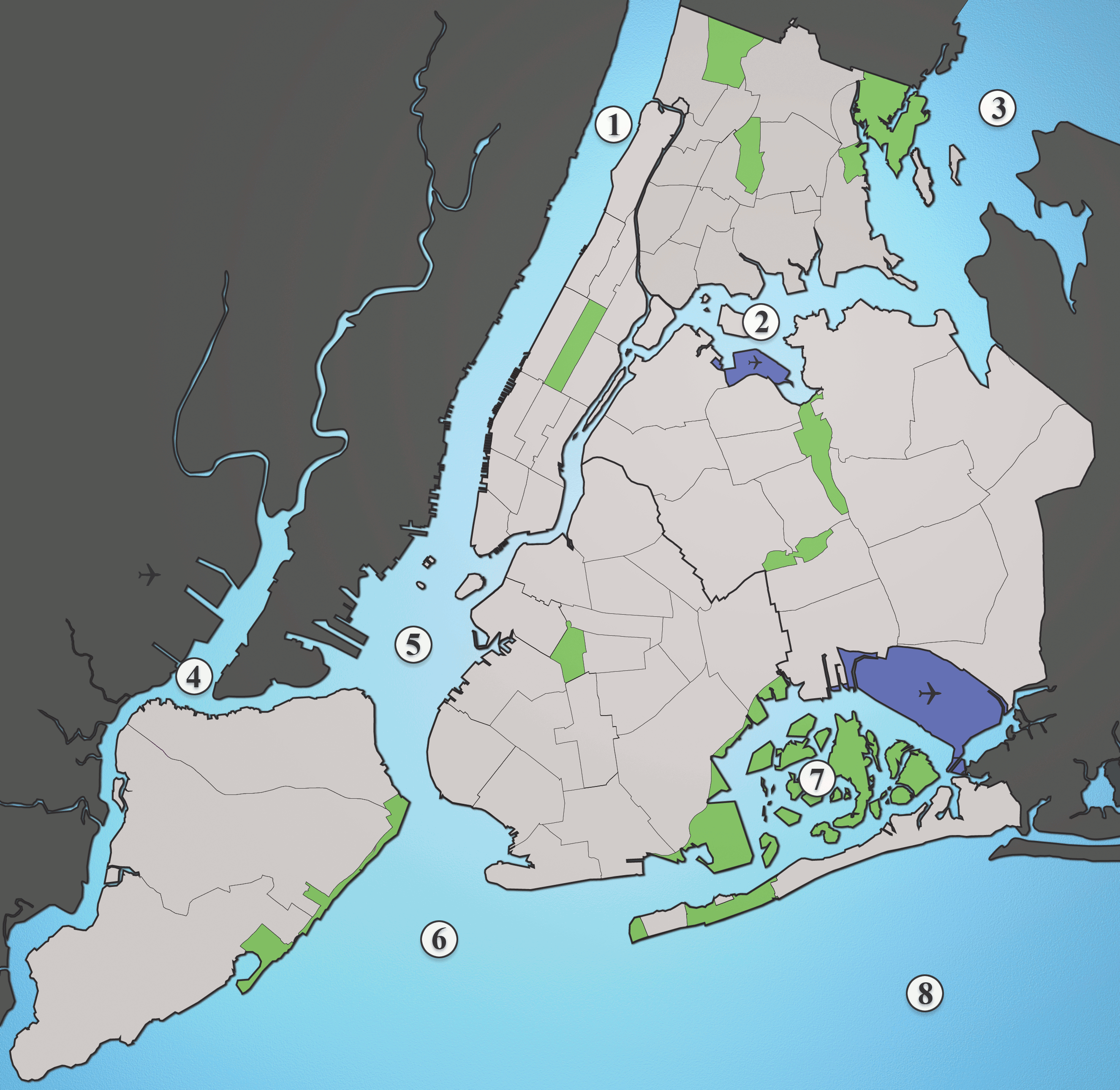
Also: do you get one bonus reinforcement for every airport you own, or do you need to own all of them for an additional reinforcement, because based on the minimap, it is the first option, but I am not sure if that is how it is meant to be.

Other than that, it seems a very interesting map and I look forward to playing on it.
“This is how humans are: We question all our beliefs, except for the ones that we really believe in, and those we never think to question.”
- Speaker for the Dead, O.S. Card
Matty wrote:
I like the roads with less opacaty better.

Im not in favor of roads, at least, not so much that you can't see anything else (like in the center). But a few roads, like in the Top-left half looks quite good actually.
Maybe you can use even a little bit less opacity.

Oh, and the bridges look bad (in the newest update thingy - in Thorpes map a while ago they were better)
"Strength doesn't lie in numbers, strength doesn't lie in wealth. Strength lies in nights of peaceful slumbers." ~Maria
Leedog wrote:
Cireon, I would have to agree on getting 1 army for each airport, they would be a territory that changes hands a lot since it allows a player to go back and forth to both sides of map.

But will get feedback from others on this issue.

Matty. we basically have 3 choices on roads:

1. No Roads at all

2. Roads with low opacity, just barley visible

3. Roads with high opacity, very "busy" look to map
Thorpe wrote:
The other choice?

4. Bring up the roads a little...
95.5% of the time you kill a players cap before your 2nd turn in... you fail or die next
Matty wrote:
I would vote roads with a medium opacity, but less roads.
But if it has to be very much roads (for some continents), than i would vote very low opacity roads i think.


(It looks weird to me having roads on the map, but not on the minimap.
The minimap looks so empty :))
"Strength doesn't lie in numbers, strength doesn't lie in wealth. Strength lies in nights of peaceful slumbers." ~Maria
Pntbttr wrote:
Yellow background is to extreme...title looks like westros's title...roads opacity could be lower a bit more...bridges yellow line is too big and ends of bridges are to sudden...
Pntbttr wrote:
matty's right I think you should get rid of a few roads so it looks less cluttered then I think you can leave the opacity the way it's...
Leedog wrote:
To get this map moving forward, I would be willing to get rid of roads entirely. Thorpe was in favor of that.

As for Bridges, they are really connection lines first, and on no other map do they go deep into the territory they are connecting.

As for yellow background, need to get feedback from Thorpe on that.

Also need feedback on color scheme from Vexer.
Vexer wrote:
i can't stand the yellow background. The colors are better than they have been in previous versions but they still aren't good. This map needs so much work that it's hard for me to get myself to comment on it. If I am frustrated I can't imagine how you feel at this point.

You will find it easier to get a good color scheme if you pick the right background color.

i think you should make your water look like the water in this map:
http://upload.wikimedia.org/wikipedia/commons/7/71/Waterways_New_York_City_Map_Julius_Schorzman.png

then you can use more pastel colors and they will match.

If you look closely at that map there is a slight gradient on the water. This is what makes the difference and makes it look good. To add this effect you can generate very large blurry clouds using two shades of grey and overlay the layer on top of the water color layer. adjust brightness and contrast as needed.
Thorpe wrote:
You need to try this Leedog...live and learn..remember this is not my map and this will train you on other maps you do...Pntbttr did a lot of work on the China map and I was hoping you would do most on this map.
Are we having fun yet?...try my bridges!
LOL
95.5% of the time you kill a players cap before your 2nd turn in... you fail or die next
Pntbttr wrote:
...looks a little cheesy but I think if you played with the colors a little bit more it would work...
Leedog wrote:
First version had the colors on the lighter side... this version has colors on darker side with paper ocean (so i could use shades of blue better without them blending in ocean) -

http://imageshack.us/photo/my-images/802/newyorkz.jpg/
Matty wrote:
Did you make the maps smaller? Or is it imagehack?

Also I currently like the paper version better, becaue it has darker colours. I usually like blue oceans, but in that version both the ocean and the territories have really light colours, almost neon like (especially that center island, makes me thing of this:
[image]
)
"Strength doesn't lie in numbers, strength doesn't lie in wealth. Strength lies in nights of peaceful slumbers." ~Maria