Remake
  • 165 posts
  • Page 4 of 11
elysium5 wrote:
This map is now just on a whole new level of beautiful! Nice work.
"I can picture in my mind a world without war, a world without hate. And I can picture us attacking that world, because they'd never expect it."
Matty wrote:
Looks absolutely amazing, some small points though:


I'm not sure about the deep blue background (part of me loves it, part of me thinks it's too deep blue, feel free to ignore this part).

The Stormlads region feels like a swamp to me. If that's intended (I don't know Game of Thrones) than kudos to you. If not, maybe change its colour a bit.


A bigger problem is that it's not obvious that "The neck" and "The twins" are in different regions.
Even difficultier to see is to which region "Iron islands" belongs to.

It's pretty obvious that "Lys" belongs to the S. Essos region, however, will it still be visible when there's troop numbers inside that circle? Because there is hardly any island outside the territory circle.

Skagos is regionless right? Because you might give it its own name on the mini map, and then put +0 beside it or something.

The mountains beside "Starfall" look artificially cut off. Maybe they should extend north into "Bitterbridge" for just a bit to make it look more natural.

It almost looks to me like one can sneak past the Wall at the left side, just at the border of the frostfangs river. Or is that just me :)
"Strength doesn't lie in numbers, strength doesn't lie in wealth. Strength lies in nights of peaceful slumbers." ~Maria
Hoodlum wrote:
Westeros 5 (click to show)


ok, after being mesmerised with it, time to be over analytical and give some sort of feedback.

wolfswood. at first glance thought wolfswood was an impassable to some of it's bordered territories because of the forest, but realized that all
bordered territories are blocked off, so it can't be an impassable.
Then scrolling down with this thought and then seeing the border between 'The Neck' and 'Cape Kraken' it looks as though it could be read as an impassable too, just because d12 users are use to seeing extra added visuals on most maps have that purpose. A similar gap of The trees between 'Thenn' and 'fist of the first men' might be a solution if this is a concern.

Could there be an added territory above 'The Frozen Shore'? looks like something needs to be there, or that border line could just be taken away.

Inset.. The second L in 'Beyond the Wall' looks like a mistake

which region does 'Skagos' belong to?

Warrant ☰ ★Officer I and a Gentleman
Hoodlum is online.
aeronautic wrote:
All good points.

I will be working to memory here, so some response will be accurate by geology & authenticity, but not necessarily by name.

In reverse order:

Skagos, is part of Beyond The Wall. The whole region is Red, but becoming bluish-white as it gets further into the region (snow and ice). I can make it more white than red to make it more obvious.

The "L" in Wall is just the size of the font causing a blur. It is there in Photoshop too. I will simply move it a couple of pixels and it will look the same as the other "L".

Above The Frozen Shore, the land is uncharted (in the story), hence giving it a name would be inaccurate. However, I could put a label there to state it is "uncharted", but it would have to be in a different font and colour to the other labels and still be fitting to the map. Alternatively, I could take the territory border away, but then again, it would lose its accuracy.

Wolfswood: There will be a Key which states the impassible's and there won't be any forests on the key.
My slight problem here is that I am staying accurate to the official maps of Game of Thrones, Land of Ice & Fire etc. and some of the borders are natural borders, i.e. Formed by Forests, Mountains and Rivers. We are all used to rivers being impassible and normally mountains too, but not forests, it could be misleading. I thought the fact it had a circle atop a forest gave away its intuitiveness, but perhaps not.
I can try moving the border away from the accurately shaped forest, but am worried about Stoney Shore - Barrowtown tiny border.

Sneaking past the wall: I see there's a wall top surface sloping downward there and in shadow, but it looks slightly camouflaged with the land there. I will darken it.

I agree with the impassible mountains in Starfall. I will rework these and spread them more.

Skagos _________________^

Lys: I will move the circle to show some island colour.

The Neck, The Twins & The Iron Islands: When I was trying to find a colour scheme that would separate territories, but still look like one naturally progressive land, I gave up and I started using artistic colours rather than the usual single colour with effect. This means I spray on whatever colour I believe would keep it similar but distinguished. After finishing everything, I noticed the similarity in colour and ran out of inspiration & energy to change it. Well spotted, I do intend to alter this in the next version.

Stormlands: This was intended to look storm battered not like marshland. I think the little hills are creating that effect, I will try a few things to make it look more stormy than marshy.

Sea Background: I eventually decided to go with the official map with the realistic land & deep ocean. If this is a problem for others, I can try other colours / textures?

Thank you to all the advisers for the valuable feedback:

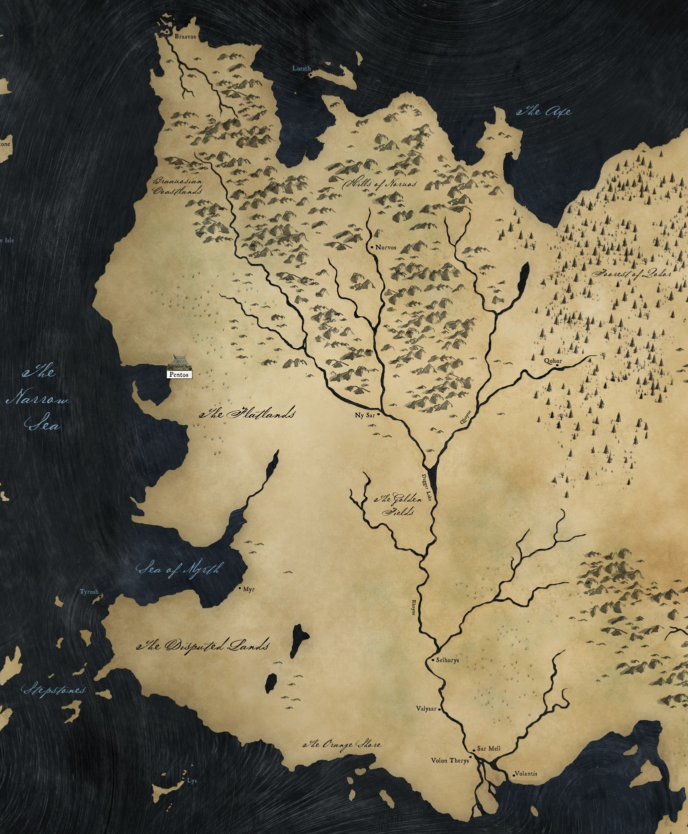
I will also need naathim & Cireon to advise on matters concerning the new split in the Essos region and their advised names.
As well as any other inaccuracies or concerns about story authenticity?
Hyd yn oed er fy mod Cymraeg , dim ond yn siarad Saesneg, felly yr wyf yn gobeithio y bydd y cyfieithu yn gywir.
Hoodlum wrote:
Sorry, have to compliment it some more.
The colour scheme is something I reeaally like, brilliantly done. Font is perfect. Gameplay looks good, but I wouldn't care, this map is that attractive and I would just play it for that reason, fan of the show or not. Can't stop looking at this.
Other after thoughts while I'm here.
 I think a dark ocean is best as you have it, it highlights the map, but agree that it could be better somehow, probably with some gradience, or maybe because the map is 3dish that the ocean needs to be too. skagos could do with some added texture also, as it is quite a big off island that is part of gameplay and to be consistent with the 3d look of the mainland.
Warrant ☰ ★Officer I and a Gentleman
Hoodlum is online.
The_Bishop wrote:
I suppose there are no impassable in this map: rivers, mountains and the wall are intended to be passable; right Aero?

As for gameplay I think ports are too many, or too many with same color, specially when they are only 2 steps distant, like 'Fist of 1st Men' and 'The Dreadfort', they doesn't seem very necessary. 3 or 4 ports of the same color are enough for my taste, but maybe the others think different. If I have to be specific I would say to remove the follwing ports: 'The Frozen Shore', 'Fist of 1st Men' and 'Myr'. Perhaps even better with moving 'Summerhall' port to 'Kings Landing' and add a connection line from 'Storms End' to 'Tyrosh'

Region borders have a thicker line since I have no problem to recognize which regions 'The Neck' and 'The Twins' belong to. But with 'Lys' I would have some serious problem, I think you can just move the circle a bit out of the isalnd to show the land colour. 'Iron Islands' I know it belongs to Westerlands region but may be not clear for someone. You can also consider to remove Cape-Kraken-to-Iron-Islands connection; that way it will be clear what region it belong to; and the connectivity in the wide wouldn't be compromised as 'Iron Islands' already borders with many territories thanks to the port connections. In case you might also add Cape-Kraken-to-The-Rills that seems more logical.

A minor detail: I don't think you need such a long dotted line between 'Lyn' and 'Volantis'.

Edit: posted to late, something has already be answered by aeronautic
«God doesn't play dice with the World» ~ Albert Einstein
aeronautic wrote:
The wall is intended to be impassible, also all rivers will be impassible and the mountain range in Starfall as well.
Therefore, the port positions take on a very different necessity, as you will see.

I have not put the impassible Key on the map yet, as the game-play still needs refining.

I know I have jumped the gun with graphics, but all my work is editable.

I feel if you have a good understanding of game-play requirements and you are able to change graphics to suit as they are discussed and agreed to, it helps to first have a good graphic representation of your intended map and theme. I would not recommend this to new map makers though, as you have to know how to set up your layer systems and know how to easily change things, plus you have to be prepared to rework many things.
Hyd yn oed er fy mod Cymraeg , dim ond yn siarad Saesneg, felly yr wyf yn gobeithio y bydd y cyfieithu yn gywir.
naathim wrote:
Crying it's so pretty!

Love all the background variation with the different textures and mountain types!

For the forest/border issue, perhaps you could just trim the forests back a bit like you did between Thenn and Fist of the First Men?

I kind of like the aqua-marine like color of the stormlands. Although I can see where it stands out a bit.

On one of my computers the western shading on the mountains between Starfall and Oldtown just comes off as a mass black. I can't make out any details. On the other computer it's not so bad, but still pretty dark.

For ports, I think Bishop is correct in saying there are too many yellow ones. I definitely think you can take out the one in Dreadfort. But other than that I'm not sure.

I like the dark blue background, although it is pretty stark. And the transitions between rivers and seas/lakes might look better if the background was lightened up a bit.

Great job aero, it looks so beautiful!
aeronautic wrote:
Changes acknowledged in Post #50 & yellow anchor removed from Post #54
Westeros & Essos 5 (click to show)
Westeros & Essos 6 (click to show)
I still need feedback on the Essos region split and proposed names.
Hyd yn oed er fy mod Cymraeg , dim ond yn siarad Saesneg, felly yr wyf yn gobeithio y bydd y cyfieithu yn gywir.
supiachao wrote:
This map is really beautiful, after looking at it carefully, these are my comments:

1. The name of the sea appear too faint, maybe using a lighter blue?

2. The anchor for the port is a little too small for my liking, maybe a lil bigger? like 110%? and put it nearer to the land?
(seems like other map anchor position is in between land and sea)

3. The yellow colour anchor is absorbed by the similar colour used in the land, will you consider a different colour? says white or a brighter yellow? (or maybe it will look better after the enlargement)

Other parts are great, the texture is amazing and very realistic. Above are just minor issue, if you don't see the needs for it it is still a fine map.

naathim wrote:
Well, there's a lot of borders, all over the map lol. So I don't think that the regions in Essos having lots of borders gives them a disadvantage.

I did kind of like the idea of every two Essos regions controlled gains you +1 bonus. But I think that would unbalance the map because a lot of people would fight it out for that. Plus it would be pretty confusing trying to explain that.

So with that said, I think the way you divided it up is pretty good. The only other way to do it would be switch Rhoyne and Qohor to S. Essos, and that would make the regions much worse to my mind.

The names all look good go me.

I think one issue that might crop up, and it's not a big one, is the impassable key. As far as I can tell the only mountains that are actually impassable are between Old Town and Starfall. And those one's look different than all the others, but I could still see people getting a little confused and thinking The Eyrie can't attack Saltpans and Rhoyne, Norvos. I think there's enough differentiation there, but thought I'd mention it.

Maybe trim back the forests between The Neck and Cape Kraken?

Can't get over how good it looks Aero, just wonderful!!
Cireon wrote:
Alright, so I am going to nitpick a bit about territory names now.

Rhoyne I think isn't great, since that is actually a river that mostly runs through the territory that is now named Volantis:

[image]

Maybe Ny-Sar is a better option?

Also Riverrun is written as a single word.

The Dreadfort actually lies in the territory currently called Last Hearth. The territory actually belongs to Karhold (map).

The actual name for Barreltown is actually Barrelton, but the entire region is called Barrowlands.

Storm's End has an apostroph missing, King's Landing as well.

*****

The gameplay looks solid enough to me, though I am not sure if it will be clear for everybody that the wall is impassible.
“This is how humans are: We question all our beliefs, except for the ones that we really believe in, and those we never think to question.”
- Speaker for the Dead, O.S. Card
Matty wrote:
Amazing.

Can't find anything to add to that really.
"Strength doesn't lie in numbers, strength doesn't lie in wealth. Strength lies in nights of peaceful slumbers." ~Maria