just an idea
  • 315 posts
  • Page 13 of 21
cbt711 wrote:
Unless all borders are vector (pen tool in photoshop, paths tool in GIMP). Then it's an easy fix, just stroke the paths with a slightly soft edged brush.

I noticed the same pixelized look on the WORLD DOUBLE map name as well. Is this on purpose?
aeronautic wrote:
Thanks cbt, I'm guessing there are no vector graphics on the source, they will probably be standard rasterised graphics, in which case, use the Magic Wand tool outside the land on the land layer and it will select up to the land, but the land is now outside the selection, so you can grab a nice big Eraser on 100% and run it around the edges of the land, some of the pixels outside the selection (on the land) will be partially erased, giving it anti-alias.
Hyd yn oed er fy mod Cymraeg , dim ond yn siarad Saesneg, felly yr wyf yn gobeithio y bydd y cyfieithu yn gywir.
Virtuosity98 wrote:
I'd just like to suggest a few minor editions that I would make:

1) Africa looks really weird in green to me. I know region colours don't look a thing like the continents in real life, but green just doesn't work with Africa for me. I think yellow, orange, or red would be better (hot colours!).

2) Asia bonus should be reduced to +7 (As India is no longer a border, with the Argentina connection changed to the Middle East)

Overall it looks great though :)
It is now Day 8. Please submit your Lynch vote, as well as any Role-specific Day actions you wish to perform (countdown).
Day Actions:
• #LYNCH [player], #NO LYNCH, #ABSTAIN in forum thread.
• Role-specific actions (via PM with V98).


The_Bishop wrote:
Okay, thanks, I will try the suggested techniques.

Yes Virtuos, Asia bonus reduced at +7, and Africa is not green anymore in the last image.
«God doesn't play dice with the World» ~ Albert Einstein
Virtuosity98 wrote:
OK, I can't see your images unless I use someone else's device, so I haven't yet seen your latest image.
It is now Day 8. Please submit your Lynch vote, as well as any Role-specific Day actions you wish to perform (countdown).
Day Actions:
• #LYNCH [player], #NO LYNCH, #ABSTAIN in forum thread.
• Role-specific actions (via PM with V98).


PsymonStark wrote:
Yep my phone does the same, I can't see the images bishop posts. Not sure why...
Living proof that everyone can be a brilliant great good decent cartographer.
The_Bishop wrote:
Sorry for the interruption guys. Work is on now! ;) 
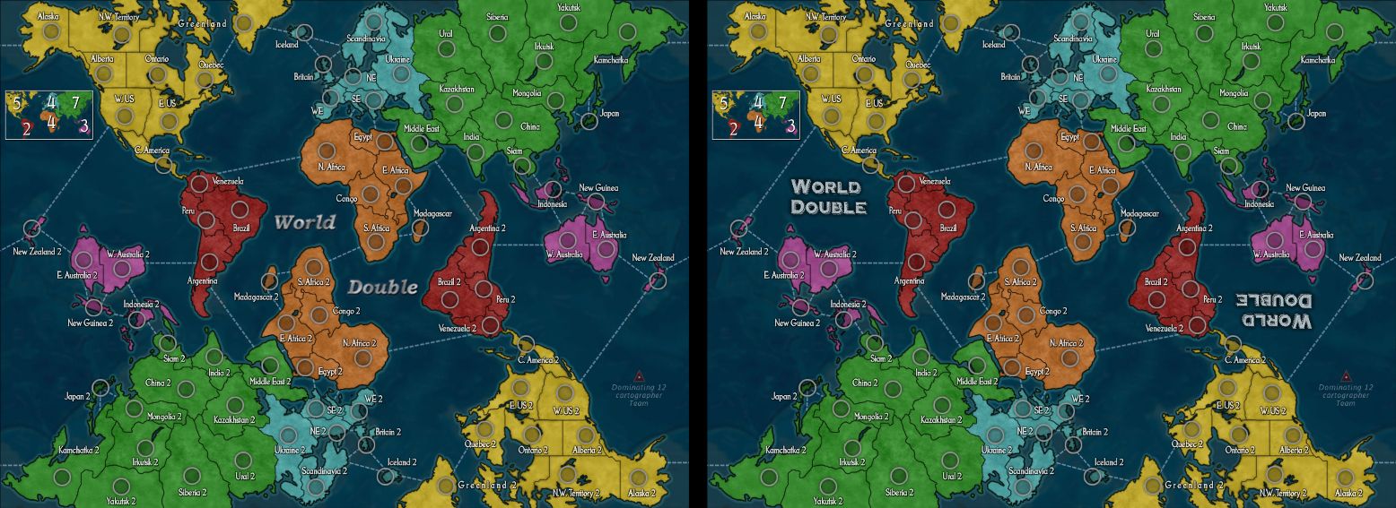
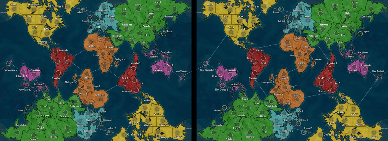
Here it's the current stage:

WD_15b (click to show)
- removed some pixelations and partially redone some outlines
- updated minimap with new colours and bonuses
- slightly adjusted some circle/tag placements

Feel free to leave comments and in case repeat what possibly has not be addressed, so it will be easier for us to focus in each subject.
I think the spacing on Greenland label is the best solution for clarity, but if people really don't like it we will study alternatives.
The title is provisional at the moment, probably it needs to be different.
«God doesn't play dice with the World» ~ Albert Einstein
Virtuosity98 wrote:
I love this map and I'm really looking forward to its release.

I'm not a fan of the text, but I can't decide why not. One thing that I don't like about it is the capital "E" (which appears often). The font looks quite sharp, I think. Maybe it's just me who'd prefer another font; if so, don't worry about it.
I'm not sure I understand the need for the Greenland label to be stretched across the entire territory, in my opinion it looks weird, out of place. People can understand the adjacencies in World Classic, which has exactly the same Greenland as World Double. I think the Greenland label should be left the same as it is in World Classic.
I agree that the title should be in a different style.

These are the only things that I would change, amongst an entire world of good graphical features - actually, make that two worlds of good!
Keep it up :)
It is now Day 8. Please submit your Lynch vote, as well as any Role-specific Day actions you wish to perform (countdown).
Day Actions:
• #LYNCH [player], #NO LYNCH, #ABSTAIN in forum thread.
• Role-specific actions (via PM with V98).


aeronautic wrote:
Yes, I agree about the labels font.

We will play around with a few and see what sits best with the community.

It may be a few days before I begin work on the map so feel free to give as much suggestion and preference for the map in the meantime and it will help to get direction.
The_Bishop is in charge of the map development, I will be acting as the painter only, under his direction.
PsymonStark will of course be the overseer and will also have the task of deciding whether or not the map is sufficiently refined and suitable for Beta.
Hyd yn oed er fy mod Cymraeg , dim ond yn siarad Saesneg, felly yr wyf yn gobeithio y bydd y cyfieithu yn gywir.
HammerTime wrote:
  Posted: Yesterday, 20:54 
Post #188
I love this map and I'm really looking forward to its release.

 I concur Virtuosity
Luck,is the defining factor of a good strategy
Hoodlum wrote:
Looking forward to playing on this, LOVE that NZ is recognized! :)
With cartographer extraerordinaire, mastermind Bishop, & eagle eyes Psymonstark as the overseer at the helm, you can expect an awesome result..
I predict a hugely popular map already. Don't think I've seen an idea like this on any other risk site.
Warrant ☰ ★Officer I and a Gentleman
naathim wrote:
It looks good. I'm still not a fan of the muddy background ocean though...

I think the title for Greenland is fine. It's not out of place or awkward. And I do think it helps to make the connections more clear. Sometimes even today I double check the NA connections because it is a little hidden.

I do think it'd be neat to have the title be upside down where the mini-map would be to compliment the existing one... But where would the mini-map go lol.

Connection lines look a little too stark?

I don't mind the font.

aaaand that's about it from me. Looks great!

The_Bishop wrote:
Wow thanks guys I get motivated by your nice lovely wording, Virtuos, Hammer and the Hood!

In World Classic what helps to get the Greenland extension is also the shade of colour inside each territory, but I'm not sure can be applied to this map.
I'm honoured by such important charge, Aero: I will be the director then! :) But I think you are Much More than a "painter" though!
Anyway I'm a bit scared by Psymon the Eagle doing the overseer... He has 25/20 vision in each eye!! (assuming two eyes of course) ;D

I also believe this map will be popular and probably even the old-fashioned lovers of World Classic will want to try it.
Plus, the entire nation of New Zealand will thank us, for including them (twice!) for the first time in a Risk map!

@naathim, how don't you like the ocean!? It's the only thing I was sure to have made finely. :( But probably it's only a tiny bit too blurred. I send to aeronautic the original version of the ocean background so he can regulate it not to look like muddy. Thanks for the advice. I really hope this background can be saved because it was a panic job to adapt real ocean ridges to this map.

Every other comment an critic is welcome, thanks guys.
«God doesn't play dice with the World» ~ Albert Einstein
The_Bishop wrote:
A couple of things I forgot to answer.
Font= I'm under zero on chosing fonts for a map really, I just took Stockfish as suggested by Psymon. It's pretty nice for me, but also very tight: letters were quite transparent in many parts (almost pixelated also, I don't know exactly why). So I had to double the layers to make them more filled and more readable, and then I reduced the opacity. But I don't know, maybe it was not the right tecnique.
Title= I think we have room for a double title between North America and Australia, without need of moving the minimap. I'm not sure the idea of making it rotated would be appreciated though, because it was discussed to be mismatching with the territory labels which are up-oriented on the whole map. Alternatively I may propose also a splitted title. Examples
Connections= Naathim I don't know what exactly means "stark", maybe you mean connection lines are too straight, you prefer them to be a bit curved?
Personally I liked the connections as they were before, more sober. Now it looks quite a spiderweb. Comparison

WD_15b for reference (click to show)
Obviously aeronautic (being the Master Painter!) has the right to change everything he sees as not good or not suitable for this map.
«God doesn't play dice with the World» ~ Albert Einstein
naathim wrote:
Lol you know me Bishop, I don't know what the heck I'm talking about when it comes to graphics work lol. Your ocean DOES look good. But I think you hit the nail on the head, a little bit too blurred. Plus there just seems to be swirls of brown in there from the ridges/mountains things. As for the connection lines I think you spoiled everybody with all your good work. The map looks amazing and then you just have the plain old connection lines lol. Stupid criticism on my part.

I actually like both of the two titles you suggest!

Connections... I feel like we've been through it all and tried every permutation, and to be honest, we won't really know what's best until it's played on... This configuration seemed to be a good compromise on original gameplay plus flow.