redone
  • 135 posts
  • Page 5 of 9
Vexer wrote:
I think the colors are better. You could make the ones on the land slightly brighter to appease matty if you want.

I also am not a fan of the title but it's not terrible and it's your map so do as you wish.. can't please everyone.\

That's all i have time for now.
Fendi wrote:
Hello.

The colours are better now and they are easier on the eyes but you can increase the brightness on the land a little, just as Vexer mentioned. I am still not a fan of the ocean though, its still too much. A paper look would be more befitting, but thats only my opinion.
Also, the new greenish colour that you have chosen instead of the orange does not look good at all (sorry), it doesnt fit with the colour scheme that you have going on.

Take care.
Pntbttr wrote:
http://imageshack.us/f/585/europe3jpeg.jpg/

What do you guys think?

Is the Netherlands good now? I tried your link and the web page doesn't seem to be there...I look on google earth for an idea of you were talking about...
Vexer wrote:
this is better. the colors are 1000 times better.

some of the colors are a bit washed out though.. a tad under saturated. just a tad, meaning adding one or two to the saturation level might do it.

This background has the same problem as the Dominican rep. map. There is too much contrast -- too much dark and light spots. it's detracting and causes you to focus too much on it. Just reduce the contrast on each of the background's texture layers. And then adjust the background color to be a little more saturated. Also the shading is so random. You should rely less and less on generating clouds and pick a paint brush. try darkening around the borders of the map and maybe along the coastlines.

The territory boundaries are too light. Was the opacity lowered or are they just a lighter color? Either increase the opacity or duplicate the layer, adjust opacity of one of them till it looks right and then merge down.

You can fit netherlands, instead of nether. I also don't like the abbreviation.

For when you do the mini map: I learned a new trick to make the mini map sharp instead of blurry. Resize the map like normal, then remove the texture layers. Then open a second copy of the image and resize again. This time when you resize it choose nearest neighbor as the resize option. Then copy the texture layers from the 2nd version over to the first.
Matty wrote:
I liked the old colours better, theres too little, well, colour in the new ones. The choice of colours is quite good though.
Have looked up what that saturation is what vexers talking about, and hes right - it can use some more of it (though I think it can use more than just a slightly more).
Also, the map makes me feel as if it rains continuously in europe - not every country is like holland :P


The shape of netherlands is better, but it still looks like a rotated rectangle (with two points sticking out of both sides)

I see that my old link doesnt work anymore - try this one for total overview: http://www.mycontinent.co/IMGEurope/europe_map3.gif
(I have the feeling that it overdoes the sticking out part a little bit, but it does show what i mean)

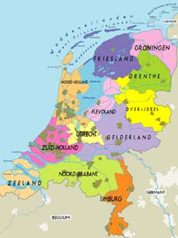
and this one for just the netherlands:
http://imagiverse.org/activities/countries/europe/netherlands/netherlands_map.jpg

(Yeah, i know, its a little country, hard to see details.)

In the second link, the orange part ("limburg";) is sticking out alot to the bottom, while the bottom of the light-green part ("noord-brabant";) is actually quite horizontal.
"Strength doesn't lie in numbers, strength doesn't lie in wealth. Strength lies in nights of peaceful slumbers." ~Maria
Pntbttr wrote:
@Matty...LOL! It was rainy outside and kinda dark when I was doing the colors...I couldn't seem to make them happy at the time...^_^
Vexer wrote:
At first glance I thought it was a little bla. But after looking at it for a few minutes it was kind of nice how easy on the eyes it is.

I suggest that you reduce the opacity of the shading layer on the mini map before you flatten it. I think when it's that small it stands out too much.

Not really a fan of the title but it doesn't bother me.

The problem I see with your modification to the netherlands outline is that at it's narrowest point it almost looks like they are touching and it looks funny. I would put 1 more pixels distance between the two lines. Even if it's not as accurate it will look better.

Other than that i am pretty much ok with this map now. Nice work bttr of the pnt.

Oh yeah and add your name (WCA too if you want) for the next version please.
Matty wrote:
The colours still look rainy to me, less like a thunderstorm, and more like a rain that's just clearing up.
As a consequence of this you must understand that we're expeciting a rainbow for the next version.

Also the Netherlands is really good now. I would just move the (top part of the) border of Belgium a bit to the right, so that the spike of the Netherlands "eats into" belgium instead of into Germany, but really well done!

About the title, maybe you should add a shadow to the left, like the territory names, and maybe remove the border. I think it will look better. The font is ok I think.
"Strength doesn't lie in numbers, strength doesn't lie in wealth. Strength lies in nights of peaceful slumbers." ~Maria
Pntbttr wrote:
http://imageshack.us/photo/my-images/696/europe4pngwithoutterrit.png/

...Matty are you sure that it doesn't look perfect? (: changing the outline takes a while and I really don't want to do it again but if you insist I will go back and change it again...

I think it is done but...
Vexer wrote:
nice update. it's done as far as I am concerned. Everyone else speak now or forever hold your peace! jk
Cireon wrote:
It's fine, and so is the Netherlands. Matty is just complaining about nothing ;) I look forward on playing it, the colours look really good now.
This might become a very popular map.
“This is how humans are: We question all our beliefs, except for the ones that we really believe in, and those we never think to question.”
- Speaker for the Dead, O.S. Card
marcoxa wrote:
nice colors. however i'm not a big fan of the brown background. i think a blue one would be better, but that's just my opinion
Pntbttr wrote:
@Matty...I traced your picture...if that makes you any happier...I don't want to be mean it's just that changing the outline takes time...which I don't have much of at the moment...

@Marcoxa...we already decided that a blue ocean was not a good idea...

I think I need to change the design on the mini map border