Map in process
  • 113 posts
  • Page 3 of 8
Hoodlum wrote:
yup, great. could you also add the value for each region please. i'm unfamiliar with the geography
Warrant ☰ ★Officer I and a Gentleman
Glessesboy wrote:
Hoodlum
yup, great. could you also add the value for each region please. i'm unfamiliar with the geography

Edit in Spoiler post
Matty wrote:
Glessesboy
How can i do the names on a usable maner? most are to long for the area
Just look at what other maps do. Italy or New Zealand for example just has a small font and puts the names partly in the sea.
"Strength doesn't lie in numbers, strength doesn't lie in wealth. Strength lies in nights of peaceful slumbers." ~Maria
aeronautic wrote:
It's better with the neutrals shaded in.
You have adjusted the scale of the map to try to stop scrolling, however, Tall Maps always have the problem of scrolling, which is why we separated the two islands in New Zealand and why we rotated Italia.
We can't have a map this scaled down, it is only a quarter the size of the map area, so with a Table Effect Background added, it looks "all table".

The reason that we added a table to Italia was because of the rotation.... we had to imply that it was a game-board.

We have other maps that are scrolling, so my suggestion is to scale it back up so that the map fits the whole width and do away with the table.

You will have less trouble with the Labels once it is scaled to full size again.
Hyd yn oed er fy mod Cymraeg , dim ond yn siarad Saesneg, felly yr wyf yn gobeithio y bydd y cyfieithu yn gywir.
msmajunior wrote:
Maps is looking great,

If i can suggest some geographic things:
Non-crossing borders can in the Netherlands easily made with important rivers. de Maas, de IJssel, de Waal etc.
-Arnhem is geographically incorrect it lays geographically in the Nijmegen region on this map.
Please do Drachten again in stead of Appelscha. My family lives there.
greetings
Mathijs
Glessesboy wrote:
how about the names this way? (click to show)

Is this the way to proceed? i'm not sure but i think its te best way.
Matty wrote:
The black on brown could work I think. Not sure, as the map is very stretched out and looks super weird and wrong.

I find the font a bit hard to read as well, is that Maabstricht? Maa1stricht? Maalstricht? I can see from Terneuzen that that 'z' in Tezel is not a 'z', but to me it doesn't feel like an 'x'.
"Strength doesn't lie in numbers, strength doesn't lie in wealth. Strength lies in nights of peaceful slumbers." ~Maria
aeronautic wrote:
Scaling is a skill in itself.

We make maps in Layers for a few good reasons, one of which is editing without affecting other parts of the map and causing unnecessary rework.

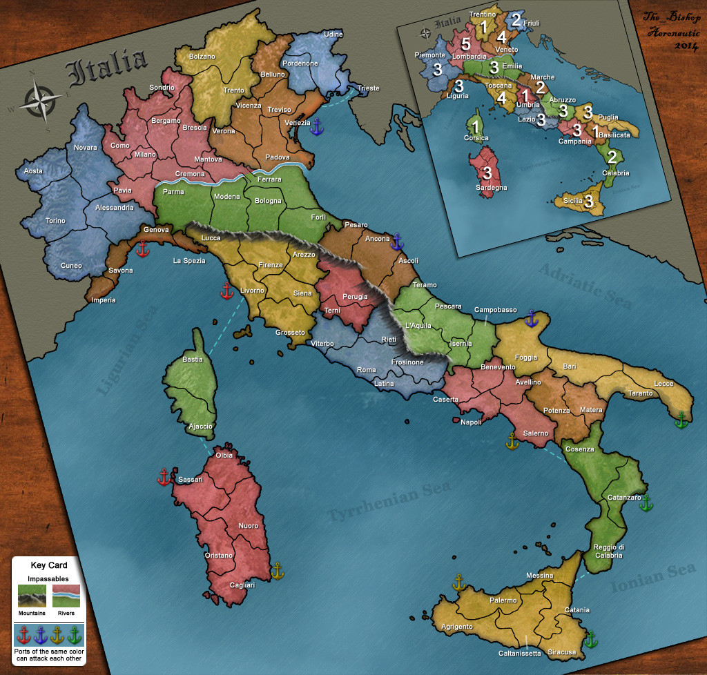
It's important to get the scale & fit of the map before undertaking all the fills and textures, which is why most map makers only post the line drawings first.
It is important to keep the correct aspect of the country if making a real Geographic map, as in this case, so deforming it to fit won't work.
If you have flattened the map and that is the reason why you are stretching the whole thing to make it fit the width, then I'm afraid, you may have to start again with a line drawing, get the scale & fit and then texture & colour the land and ocean in Layers, as well as new layers for the Labels and other things.

Please message me if there's anything you need to know about the Layering process of map construction.
Hyd yn oed er fy mod Cymraeg , dim ond yn siarad Saesneg, felly yr wyf yn gobeithio y bydd y cyfieithu yn gywir.
msmajunior wrote:
msmajunior
Maps is looking great,

If i can suggest some geographic things:
Non-crossing borders can in the Netherlands easily made with important rivers. de Maas, de IJssel, de Waal etc.
-Arnhem is geographically incorrect it lays geographically in the Nijmegen region on this map.
Please do Drachten again in stead of Appelscha. My family lives there.
greetings
Mathijs
The_Bishop wrote:
An ancient map of the modern Netherlands with a 3Dimensional look, that's original in the end. Half joking.
The squashed compass dosn't make sense though, and I suppose those white canals are impassable but they are a bit weird.
Some territories almost touch each other, maybe they do, maybe they don't, I'm not sure actually.
«God doesn't play dice with the World» ~ Albert Einstein
Glessesboy wrote:
new outlines (click to show)

Hey people, I'm back hahahaha. Just for the good measure, so I don't do more work for nothing.  Is this size doable or?
Matty wrote:
It looks very stretched to me. Why not pick the real size?

Yes, scrolling and unused space isn't ideal, but it's not the end of the world.
"Strength doesn't lie in numbers, strength doesn't lie in wealth. Strength lies in nights of peaceful slumbers." ~Maria
Glessesboy wrote:
the idea was for it to be as less scrolli as posible (click to show)

Glessesboy wrote:
Should I move forward with this design or not? What do you guys think?
Also I can make a small map of it to see how it looks? Like less territories.
Matty wrote:
Maybe the better question is: do you want to move forward with it? If so, do it.

I personally don't like modifying a territory just so that you have to scroll better, but then they did it for the New Zealand map, and it works very well. So have a try and see? It's not my map, it's yours. I just comment a bit with my opinions. Feel free to use whatever you think of that is useful and ignore the rest :)
"Strength doesn't lie in numbers, strength doesn't lie in wealth. Strength lies in nights of peaceful slumbers." ~Maria