Thanks Fendi, you reminded me what I wanted to say. I like how Psymon set the bonuses with the exclaves and I like the bonuses to be written on the land. Since it would be a special case with no mini-map nor legend but the same already occurred with the basketball map really.
The point is to make thing clear, of course. The
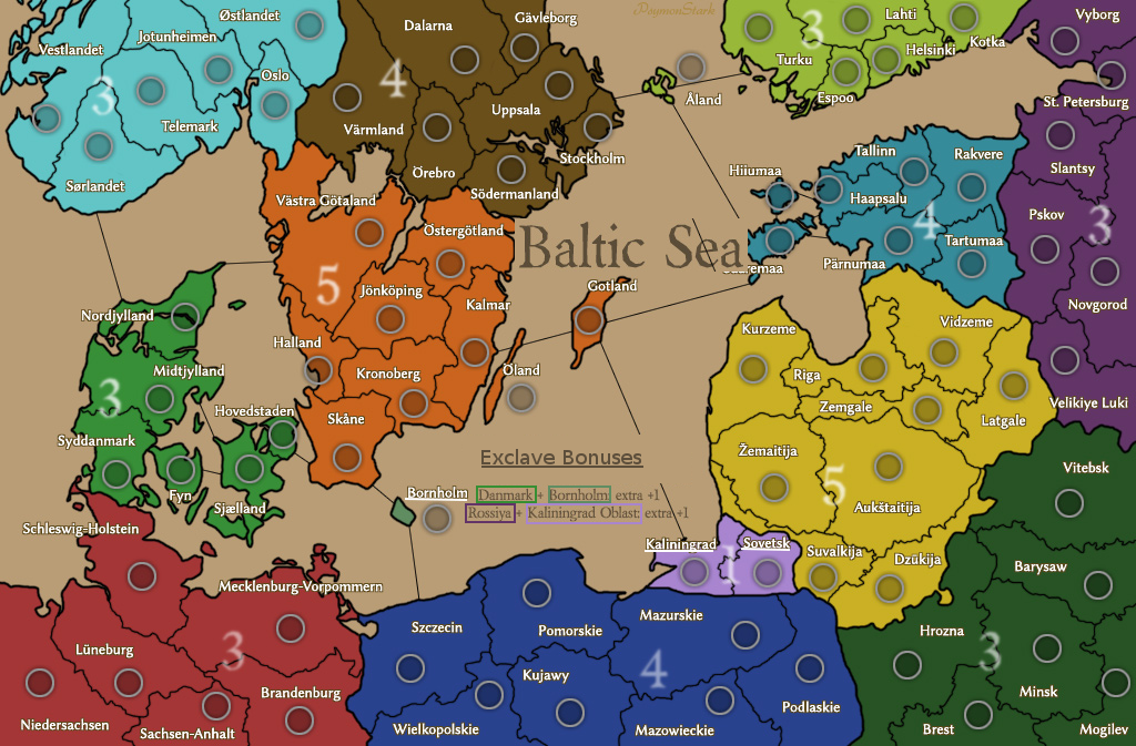
Last Version is already more clear for being color coded as remarked by Ultras. What I forgot to say is: I think the Denmark bonus and Russia bonus should be written like
3* and
4* (rather then
3 and
4). That is something that immediately make people to ask "what those asterisks mean?".
Even more, I think you can add somewhere an explication with asterisk like:
* Regions with exclaves have special bonuses:-- then the description as it is now --And eventually underline the exclave territories on the map as it was in
my previous example.
Also about the legend/key I forgot to say the colored texts seems to need a tiny frame or shadow around the letters to make them more readable and well visible.
The long "Kaliningrad Oblast" maybe can be shorten in "KGD Oblast" to fit better.
I think this is the maximum we can do to make things clear without ruining the map. Then if someone cannot really understand and maybe he's playing the map for the first time, he can ask to someone other in the game maybe, or if he cannot ask... It won't be so compromising just because the matter is about +1 bonuses: it is not something that he'll lose the game because he couldn't understand the legend! It's much worse for comparison when people don't understand how ports work, and sometimes it happens. But okay, in fact is normally only the very first time.
Apart from that, I have one more critique, I hope Psymon won't hate me for that. The territory font is cool but... not very readable, especially the special characters, like "O with double dot" seems to be U. I mean we already have to read hard Slaves and Nordic names, at least make them well readable as possible! Otherwise I get the headache!

In few words... I preferred the previous font for its readability.
@Psymon - I like better if you show the map with circles because things are more clear.
From my side, I am studying the caps... I think I am going to set them without watching yours and then make a comparison and a final re-evaluation.
Thanks Fendi, you reminded me what I wanted to say. I like how Psymon set the bonuses with the exclaves and I like the bonuses to be written on the land. Since it would be a special case with no mini-map nor legend but the same already occurred with the basketball map really.
The point is to make thing clear, of course. The [url=http://www.bluemelon.com/photo/5272549.jpg]Last Version[/url] is already more clear for being color coded as remarked by Ultras. What I forgot to say is: I think the Denmark bonus and Russia bonus should be written like [b]3*[/b] and [b]4*[/b] (rather then [b]3[/b] and [b]4[/b]). That is something that immediately make people to ask "what those asterisks mean?".
Even more, I think you can add somewhere an explication with asterisk like:
[b][size=18]*[/size] [i]Regions with [u]exclaves[/u] have special bonuses:[/i][/b]
[i]-- then the description as it is now --[/i]
And eventually underline the exclave territories on the map as it was in [url=http://i1354.photobucket.com/albums/q700/Photo_Bishop/Draft_02_zps3b40d3cf.png]my previous example[/url].
Also about the legend/key I forgot to say the colored texts seems to need a tiny frame or shadow around the letters to make them more readable and well visible.
The long "Kaliningrad Oblast" maybe can be shorten in "KGD Oblast" to fit better.
I think this is the maximum we can do to make things clear without ruining the map. Then if someone cannot really understand and maybe he's playing the map for the first time, he can ask to someone other in the game maybe, or if he cannot ask... It won't be so compromising just because the matter is about +1 bonuses: it is not something that he'll lose the game because he couldn't understand the legend! It's much worse for comparison when people don't understand how ports work, and sometimes it happens. But okay, in fact is normally only the very first time.
Apart from that, I have one more critique, I hope Psymon won't hate me for that. The territory font is cool but... not very readable, especially the special characters, like "O with double dot" seems to be U. I mean we already have to read hard Slaves and Nordic names, at least make them well readable as possible! Otherwise I get the headache! :)
In few words... I preferred the previous font for its readability.
@Psymon - I like better if you show the map with circles because things are more clear.
From my side, I am studying the caps... I think I am going to set them without watching yours and then make a comparison and a final re-evaluation.

![[image]](http://www.bluemelon.com/photo/5274200.jpg)

![[image]](http://www.bluemelon.com/photo/5277018.jpg)
![[image]](http://www.bluemelon.com/photo/5277291.jpg)