my newest creation, tell me what you think.
  • 93 posts
  • Page 3 of 7
Vexer wrote:
The mountains are still ridiculously steep in places and strangely shaped.

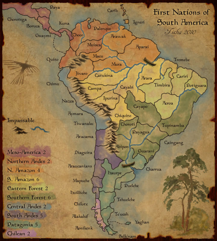
Take a look at this map on a competitor's site as an example of what would work good with this map.

http://maps.conquerclub.com/First_Nations_South_America.L.jpg

Is that a long and skinny lake I see on the map? If it's supposed to be a river then it needs to run to the sea--that is the definition of a river.

You still need to do something to make the regions more distinguishable, like darken the color. I know you are resistant to this because you feel like it would ruin the style of the map. Well, not doing it ruins the usability of the map. We don't make maps to just look pretty, we make them to be playable risk maps. What good is it to make the map if no one will play on it because it takes too much effort to differentiate the regions?

That south america map that I linked to has a very similar style to yours and yet the colors are darker and much easier to tell the regions apart. If they can get it to work, then so can you.

marcoxa wrote:
there is an update coming, sorry for the delay. i almost finished it last night but the the program froze and erased all my nights work :/
marcoxa wrote:
Map Update:

fixed river
fixed colors
added bridge
changed mountains
changed signature

                      
http://i187.photobucket.com/albums/x2/123william123_2007/KeevaIsland8_zpse94dcf8f.png
[image]
 
Cireon wrote:
That's a long time ago since we saw something from this map, so I am not gonna read up again on everything.

A few small feedback points:
I would get rid of the territory lines below the mountains, because those are actually a boundary on theirself. I don't like seeing the line also, it feels a bit ugly. I DO like the mountains in general though, though you could MAYBE make them a little bit taller.

The map in general has a very yellow-ish feel. It has a brown/yellow tint over it, so you might want to look into that a bit.

The bridge looks a bit out of place, but bridges always have been a problem...

The region colours are not right on the minimap. I would probably also show where the mountains are on the minimap, so it is easier to navigate around.


I don't know if you want suggestions for region bonuses. I feel the gameplay itself on this map is actually good now, so I am just gonna suggest some, even though they should be revised by a more experienced player probably:
Lez: 2
Nuktoova: 3 (or 4)
Hagi (purple): 2
Hagi (orange): 2
Bret: 4 (or 3)
Mojen: 4
Nova: 2
Polken: 3
Key Islands: 4

I usually looked at the amount of border countries, sometimes "rounded a bit down", because some regions have a lot of borders, but they are relatively small, so giving a high bonus would be a bit strange.
“This is how humans are: We question all our beliefs, except for the ones that we really believe in, and those we never think to question.”
- Speaker for the Dead, O.S. Card
marcoxa wrote:
ya i thought about removing the lines below the mountains but i wanted to make sure that everyone liked the mountains before i did anything else to the map.

the bridge was just thrown in there, not sure what look i am going for yet. suggestions would be appreciated. also the minimap has not been updated in a while since i have been tweaking the colors. and the yellowish tint is done on purpose.
Cireon wrote:
Alright, won't comment on the yellow tint anymore. I like the bridge at that location, just need to get a nice look attached. The mountains are fine by me, though I would make them a little bit taller (and maybe a little bit more pointy). I like how they really blend into the map, though I would have to see the mountains without the lines to really give see how it looks.
“This is how humans are: We question all our beliefs, except for the ones that we really believe in, and those we never think to question.”
- Speaker for the Dead, O.S. Card
marcoxa wrote:
Map Update:
bridge changed
lines under mountains removed


if the mountains are good i'll update the minimap

http://i187.photobucket.com/albums/x2/123william123_2007/KeevaIsland9_zps294ee80e.png
[image]
Thorpe wrote:
The color of the mountains...the color needs to go to the ridge, as Neropleat...move the color over to the west to the peek.

Also Vohis and Frenadom can attack? And is that a line peeking through?

Ransoon and Asop has a straight little line running east to west...right above the "A".

A couple places the territory lines need to touch the mountains...you can not have breaks between the territories.

I would like to see what you could do to my mountains on Middle Earth...are you up for it?
95.5% of the time you kill a players cap before your 2nd turn in... you fail or die next
Cireon wrote:
I like the update, though I agree with Thorpe's suggestions. Bridge also looks better now.
“This is how humans are: We question all our beliefs, except for the ones that we really believe in, and those we never think to question.”
- Speaker for the Dead, O.S. Card
marcoxa wrote:
ok i can fix that, and do you want the color of the mountains to change?

no they can not attack, but Frenadom can attack Rabie

i think you are referring to the texture, i might be able to get ride of that little line if its bothering you that much.

yes i can fix that as well

sure, what look are you going for?
Thorpe wrote:
No it is not the texture on the line it is the territory lines curve...and as the color of the mountains just bring the color of territories up to the ridge...then we will see.

Frendadom does not have the mountains blocking it from Vohis.
95.5% of the time you kill a players cap before your 2nd turn in... you fail or die next
Matty wrote:
Im sorry I didnt react on this map for a while.
I don't know what to improve, but for some reason I really don't like how it looks.

I don't know, everything is so brown, dark, colourless, joyless.
"Strength doesn't lie in numbers, strength doesn't lie in wealth. Strength lies in nights of peaceful slumbers." ~Maria