So here my Italy map description as I promised. Tring to be short... But this is long!
Sorry for the low quality of this post, I haven't checked grammar and dictionary carefully.
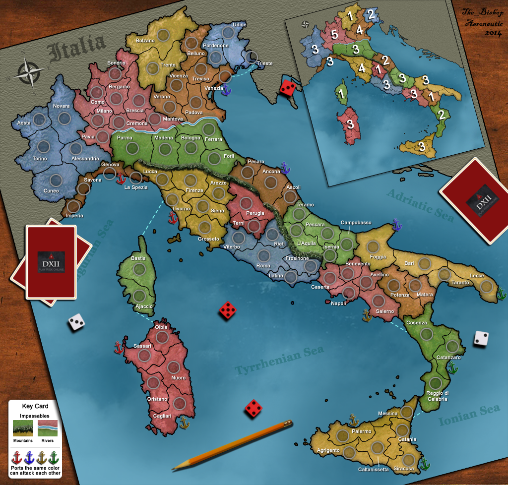
<<< GENERAL DESCRIPTION >>>Let me spend some words to say that it is a very realistic one: towns, regions, Po river and Appennini mountains are located as they really are. Coasts and borders has been duplicated from a real map with a special technic.
Some provinces really has been merged for game reasons so getting a map of 81 territories. I choosen this size being ideal for any numbers of players from 5 to 9 (or even 10) giving a good divisibility (minimizing the number of neutrals, avoiding the multiple of 3 as starting amount of territories).
The provinces of Italy really are more than 100, since many has been merged, but really they changed many times in the Italian history (and still changing) since I removed all the new small ones.
Even two small regions has been marged as parts of larger ones, Aosta Valley as part of Piedmont and Molise as part of Abruzzo, just as it was in the past (I don't know exactly, let say 50 years ago). One foreign region has been added to the map as part of Italy, this being Corsica, we already discussed that, it's just funny to include it and useful for the game.
Real regions:
http://en.wikipedia.org/wiki/Regions_of_ItalyGame regions:
http://i1354.photobucket.com/albums/q700/Photo_Bishop/Italy_Regions_zps2ec96adf.pngAs every Italian child knows, 4 main seas touch our peninsula: Ligurian, Tyrrhenian, Ionian and Adriatic. I provided 3 ports for each sea, making them of different colors so that only ports on the same sea can attack each other.
So here the map at the current state:
http://www.the-inkstore.co.uk/frame/Italia_11.pngThe image has been rotated to look like a real game board lying on a table, this giving a better fit into the screen. Map rotations are rarely allowed at D12 but in this case it looks like we get a special permission.
<<< STANDARD GAME-PLAY >>>It's a large size map (81 territories) with a complex shape, I would say pretty high as connectivity.
Regions are 19 having a small mean size and pretty low in difensibility, but as I said in my previous message, notice how many small regions are there. So let's look at them better:
REGIONS by BONUSES
+1 regions of 2 territories: Trentino, Umbria, Corsica, Basilicata;
+2 regions of 3 territories: Friuli, Marche, Calabria;
+3 difensible regions --- 3 borders, 5* territories: Piemonte, Emilia, Abruzzo, Sardegna and Sicilia (*6 territories);
+3 undifensible regions --- 4 borders, 4 territories: Liguria and Puglia;
--- 4 borders, 5 territories: Lazio and Campania;
+4 regions --- 5 borders, 6 territories: Veneto and Toscana;
+5 region --- 6 borders, 8 territories: Lombardia.
I consider the last 7 in the list to be hard regions, the other 12 are worthy in my opinion. Bonuses match with the Vexer's formula. As you can see Lombardy and Sicily are the only odd-balls, the others having at least one regions with exactly same conditions.
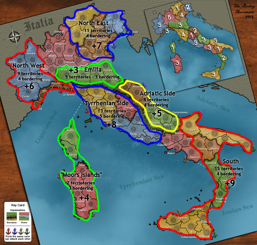
But more than that I want to invite you to take a look at the "Super-Regions"
Image:
http://i1354.photobucket.com/albums/q700/Photo_Bishop/Super-Regions_zpsfaef962e.pngSUPER-REGIONS BY BONUSES:
Emilia +3: just the region as it is, but it can be merged as part of the Adriatic Side
"Moors Islands" +4: (CORSICA + SARDINIA) the smallest and easiest super-region with only 3 borders with a total of 7 territories, just juicy! The name come from the regional flags of these regions, or just call it "Great Sardinia" if you want.
Adriatic Side +5: (MARCHE + ABRUZZO) the second by size, but here the borders are 4, so making it surely less juicy but still worthy. Notice the same conditions can be reached by conquering EMILIA+MARCHE, but MARCHE+ABRUZZO looks to me stronger, having 2 couple of adjacient borders and having the territory of Ancona an indirect difensive role on the south trough the port in Foggia.
North-West +6: (PIEDMONT + LIGURIA) an interesting one, not so hard as it seems. It's true that the borders are 4, but you can easy expand from PIEDMONT to occupy 3/4 of LIGURIA still having only 3 territories to defend! So a player conquering PIEDMONT can become very dangerous! Plus Genova looks like a nice strocking point.
North-East +7: (TRENTINO + VENETO + FRIULI) the last region can be the starting point, expanding from FRIULI to occupy half of VENETO without adding more borders to defend and then expand to complete the job! Just for reference, this is an historical area for real, once called "The 3 Venices".
Tyrrenian Side +8: (TOSCANA + UMBRIA + LAZIO) not a very interesting one really, having 5 borders to defend it's too hard! But borders can be reduced to 4 using Roma as internal defense or simply conquering TOSCANA, UMBRIA and 3/5 of LAZIO minimizing the borders to 4.
South +9: (SICILY + CALABRIA + BASILICATA + APULIA) it seems too hard to conquer, but still the borders are only 4 so not so hard to defend. But what is really interesting here is a minor super-region formed by only SICILY + CALABRIA + Lecce: this one having 10 territories and only 3 borders to defend, giving a nice +5 bonus! We can call it the
"Great Sicily". Another possibility, less interesting but still worthy, is the "Great Apulia" = APULIA + BASILICATA + Cosenza: 7 territories, 4 borders, +4 as bonus.
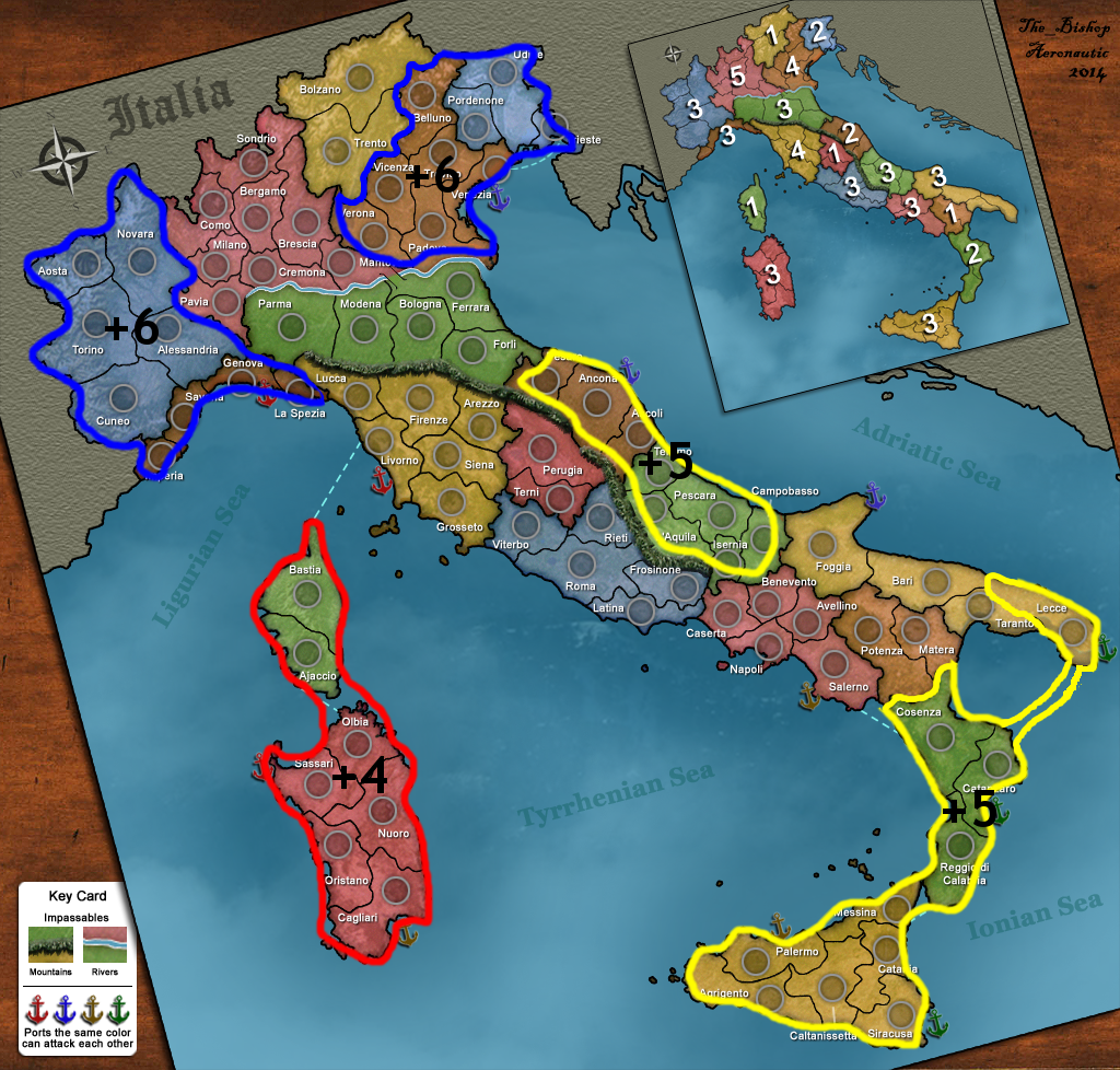
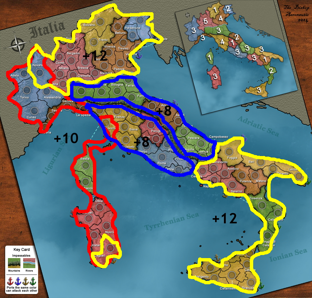
Some super Regions can be expanded even more: "North-East" can be expanded to include also LOMBARDY and Novara so forming a huge super-region with 20 territories and 4 borders giving a +12 bonus, as well as "South" can be expanded to include also CAMPANIA and Cagliari so forming a huge super-region with the same parameters except that it has 1 territory more.
If you want you can recall them in this way:
5 smaller super regions:
http://i1354.photobucket.com/albums/q700/Photo_Bishop/smallerSR_zpsc01fb896.png5 wider super regions:
http://i1354.photobucket.com/albums/q700/Photo_Bishop/largerSR_zps3b838ee1.pngThe wider ones are mostly about fixed/capped games because in a standard increasing game will be hard to have the time and the power to built such big empires before the game enters in the killery phase. But also if you play it with only 5 or 6 players so having a greater reinforcement per turn, then the super-regions become more importants and the game delays more to enter the last phase.
I want also to highlight the "low-interest area" that is practically formed by the regions that are not easy to conquer, nor are part of any easy super-region. They can be nice as ricovery area when you are too weak. First of all the big Lombardia, having a role of "Asian region" in this map. (This is for real the Italian region with more inhabitants and more provinces.) And also Tuscany, Lazio and Campania being harder regions. The 3 undifensible regions in the middle aren't so bad, providing an important North-South path if not owned. Veneto also is an hard one but having a small internal region makes it much more conquerable.
Image:
http://i1354.photobucket.com/albums/q700/Photo_Bishop/lowArea_zps1d799c31.jpgSo speaking about increasing games what is important is to know are the possible paths in order to stroke and kill your opponents when it's the right moment. So keep in mind the sea connections and the place where you can translate from one sea to the other trough the land.
This image should clarify:
http://i1354.photobucket.com/albums/q700/Photo_Bishop/seaPaths_zps28edcf57.pngAs I said it's a complex shape map!
Another important thing is where are the best locations to bunch his own troops in order to be able to stroke everywhere in the maps. I think the best stroking point should be Ancona being able to easy reach the North, the South and the West. But also Genova looks good in my opinion and also somewhere in the South, probably the best is the port of Salerno. But I am not sure to having studied them enough. The territory of Roma is also interesting for its ability to block the North-South path.
Only 3 territories are useful "prisons" to protect an opponents, lets call them semi-deadends having only 2 ways out (adjacent each other). Those are Imperia, Aosta and Trieste. As I said the connectivity is pretty high in this map.
To resume what I said in an image:
http://s1354.photobucket.com/user/Photo_Bishop/media/details_zps2cb6bf6b.png.html<<< CAPITALS >>>I tried to make the map as good as possible for capital games, so having many territories inside the region with at least 3 ways out, that is also a reason that you cannot find any regions with less than 3 borders except the smaller ones.
So here my proposal as capital:
http://oi62.tinypic.com/16ii58y.jpg2 caps: Firenze and Napoli, both having 4 adjcences. I liked this placement for having 3 different and completly detached paths between one cap and the other. Giving 40% odds to each player to have one free path against his opponent (3*0.67^5 = 0.395).
Not very interesting for standard games to play 2 caps in this map, but it can be worth for same-time games.
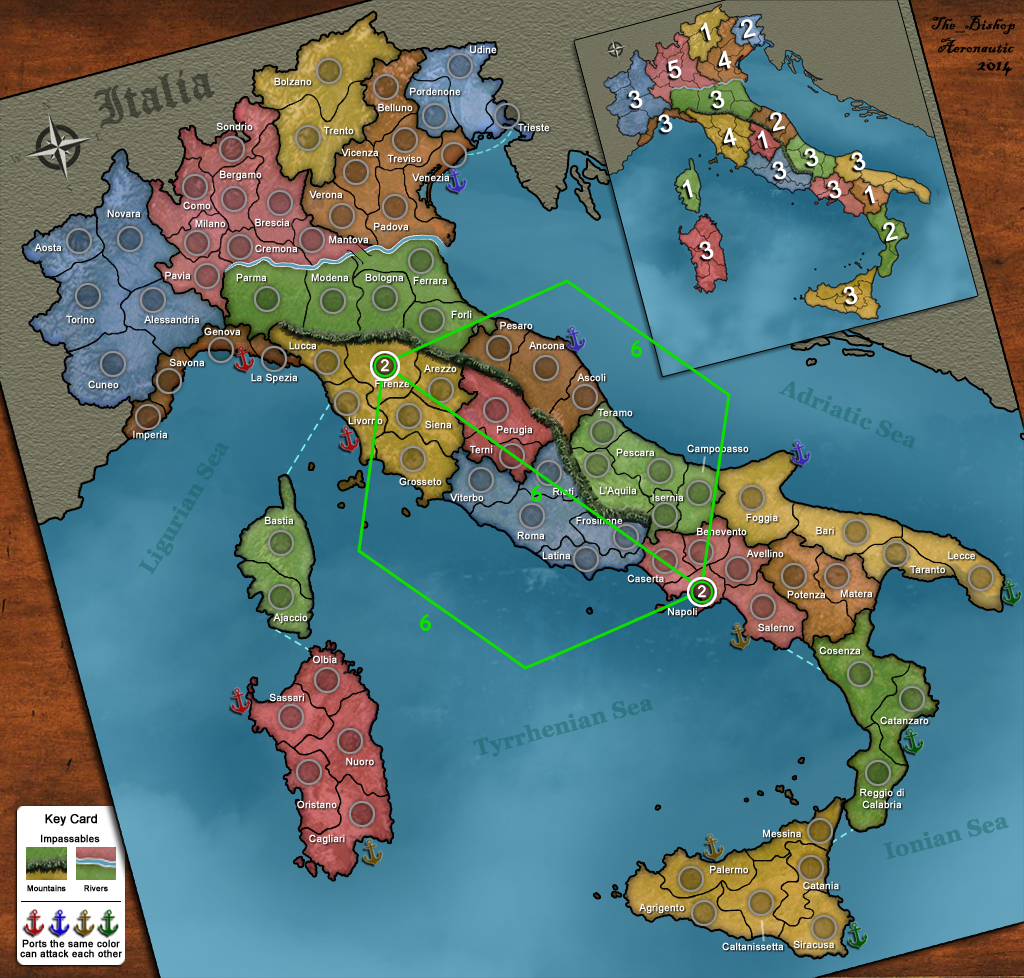
http://i1354.photobucket.com/albums/q700/Photo_Bishop/Italiy_2caps_zpsfcb049f5.png3 caps: Firenze, Pescara, Caltanissetta.
Equal 6 hops paths. Still a setup mostly for same-time games.
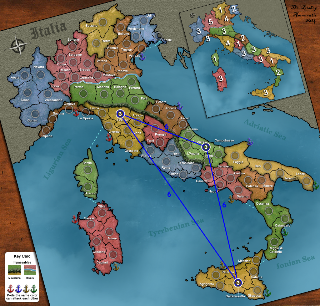
http://i1354.photobucket.com/albums/q700/Photo_Bishop/Italiy_3caps_zps145ca17d.png4 caps: Torino, Padova, Roma, Caltanissetta.
Always 6 hops paths with 2 little exceptions. Still a low number of players.
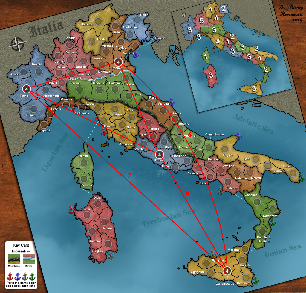
http://i1354.photobucket.com/albums/q700/Photo_Bishop/Italiy_4caps_zpse9cdb2f9.png5 caps: Torino, Padova, Firenze, Pescara, Caltanissetta.
The paths are traced in the image, the thick ones are 4 hops, the thin ones are 6 hops.
http://i1354.photobucket.com/albums/q700/Photo_Bishop/Italiy_5caps_zps6fc94512.pngFor 6 caps and higher...
the thick lines are short paths (3 or 4 hops),
the thin lines are medium paths (5 hops),
thin dotted lines are long paths (6 or 7 hops), just when it seemed logical to remark them.
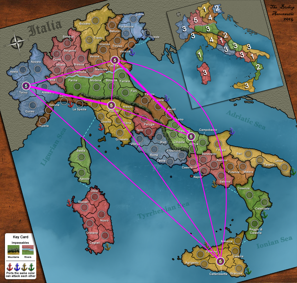
6 caps: Torino, Bergamo, Padova, Firenze, Roma, Napoli.
A standard hexagon of short paths, plus some diagonal (medium or long).
Torino and Napoli are a tiny bit unfavourited by the paths.
http://i1354.photobucket.com/albums/q700/Photo_Bishop/Italiy_6caps_zpsd9ec7541.png7 caps: add Nuoro.
It seems to be super good for its vicinity with many capitals, but notice the self-blocking path trough the port of Livorno so that we can say this capital has only 2 ways out and half, instead of 3.
http://i1354.photobucket.com/albums/q700/Photo_Bishop/Italiy_7caps_zpsec5da36b.png8 caps: add Catania.
A bit apart from the others having only a long 6 hops path to Venezia as third option, but it doesn't look to be a great disadvantage. By the way the 8 caps is the most beautiful placement, the one that fill better the map.
http://i1354.photobucket.com/albums/q700/Photo_Bishop/Italiy_8caps_zpsfa06a0e1.png9 caps: Torino, Bergamo, Padova, Bologna, Firenze, Nuoro, Roma, Pescara, Napoli.
Similar, removing the Sicilian cap, adding Bologna and Pescara. Unfortunately they are not close enough to have a decent path. By the way every cap has at least 3 short paths and not more than 4. Pretty balanced!
http://i1354.photobucket.com/albums/q700/Photo_Bishop/Italiy_9caps_zps7fe280af.png<<< REFORMS >>>So here would be the place to discuss the amendements proposed mostly by Vexer and Matty. I know the importance of the difensibility in order to have a nice game-play. Here really I tried a different way based on many "little and easy" regions and some "large but not so hard" super-regions, this giving the possibility to have a map that is good both for Deathmatch and Capitals. If I make for example a comparison with NYC map, then my regions look a bit more difensible, but still I played plenty of good games in NYC map. I can understand Vexer's thoughts, probably he realizes that in a land of such a shape as Italy we could get a game-play much more close! But well, these were my feelings when I planned this map and now... I am not in the mood to change everything! Then everybody can see things in a different way and so we will be never all on the same line. But still I think that Matty proposal is pretty suitable. So moving the green ports to Reggio Calabria and Taranto (instead of Catanzaro and Lecce) and at the same time removing the connection between Venezia and Trieste as proposed by Vexer. It is a little reform that doesn't change so much the whole game-play nor the capital placement. But if you ask to me, I vote for no changes. It seems to me that this reform ruins the equilibrium in the region bonuses, and I don't think that every map must have a super-easy region to conquer in order to propel the fight. Here I searched more a sober style. Plus those territories are parts of the super-regions that I described, so that, in my opinion, they are already interesting as they are and I don't know what is the result of making them easier. A part from that I evaluate as positive for the game-play to add some more dead-ends territories, especially in the South, but this is a minor feature for me. So here I present the Italy map in this way according to my design, then you can propose any change that you think can be improving... More heads can do better than one, of course!
<<< GRAPHICS >>>I want to send a great THANKS to Aeronautic for the job he has done. He has been very precis and meticulous on doing that. Duplicating the bounderies from a real map and fitting tags and circles in such little places, using a suitable font, small but well readable. Because as you can see there are a lot of "ocean" in this map, so being a bit hazardous to make it with 81 territories! I had personally under-evaluated this problem but he menaged it very well. I couldn't do it by myself. So I want to encourage Aeronautic to finish this job that is taking more time than predicted.
The color scheme that I like better is the Italia_11, the one that I used in this post. By the way the new mountains and anchors look better than before. I am also proposing to add some objects on the board to make it more realistic and funny, something like cards and dice. I had sent an e-mail to Aeronautic for that, but maybe it's better to discuss it in public.
Something like that:
http://i1354.photobucket.com/albums/q700/Photo_Bishop/Italia_11_modified_zps69ff7b66.pngWhat do you all think? It's amazing beautiful for me, but maybe you think it's weird. Let me know please.
So here my Italy map description as I promised. Tring to be short... But this is long!
Sorry for the low quality of this post, I haven't checked grammar and dictionary carefully.
[b]<<< GENERAL DESCRIPTION >>>[/b]
Let me spend some words to say that it is a very realistic one: towns, regions, Po river and Appennini mountains are located as they really are. Coasts and borders has been duplicated from a real map with a special technic.
Some provinces really has been merged for game reasons so getting a map of 81 territories. I choosen this size being ideal for any numbers of players from 5 to 9 (or even 10) giving a good divisibility (minimizing the number of neutrals, avoiding the multiple of 3 as starting amount of territories).
The provinces of Italy really are more than 100, since many has been merged, but really they changed many times in the Italian history (and still changing) since I removed all the new small ones.
Even two small regions has been marged as parts of larger ones, Aosta Valley as part of Piedmont and Molise as part of Abruzzo, just as it was in the past (I don't know exactly, let say 50 years ago). One foreign region has been added to the map as part of Italy, this being Corsica, we already discussed that, it's just funny to include it and useful for the game.
Real regions: http://en.wikipedia.org/wiki/Regions_of_Italy
Game regions: http://i1354.photobucket.com/albums/q700/Photo_Bishop/Italy_Regions_zps2ec96adf.png
As every Italian child knows, 4 main seas touch our peninsula: Ligurian, Tyrrhenian, Ionian and Adriatic. I provided 3 ports for each sea, making them of different colors so that only ports on the same sea can attack each other.
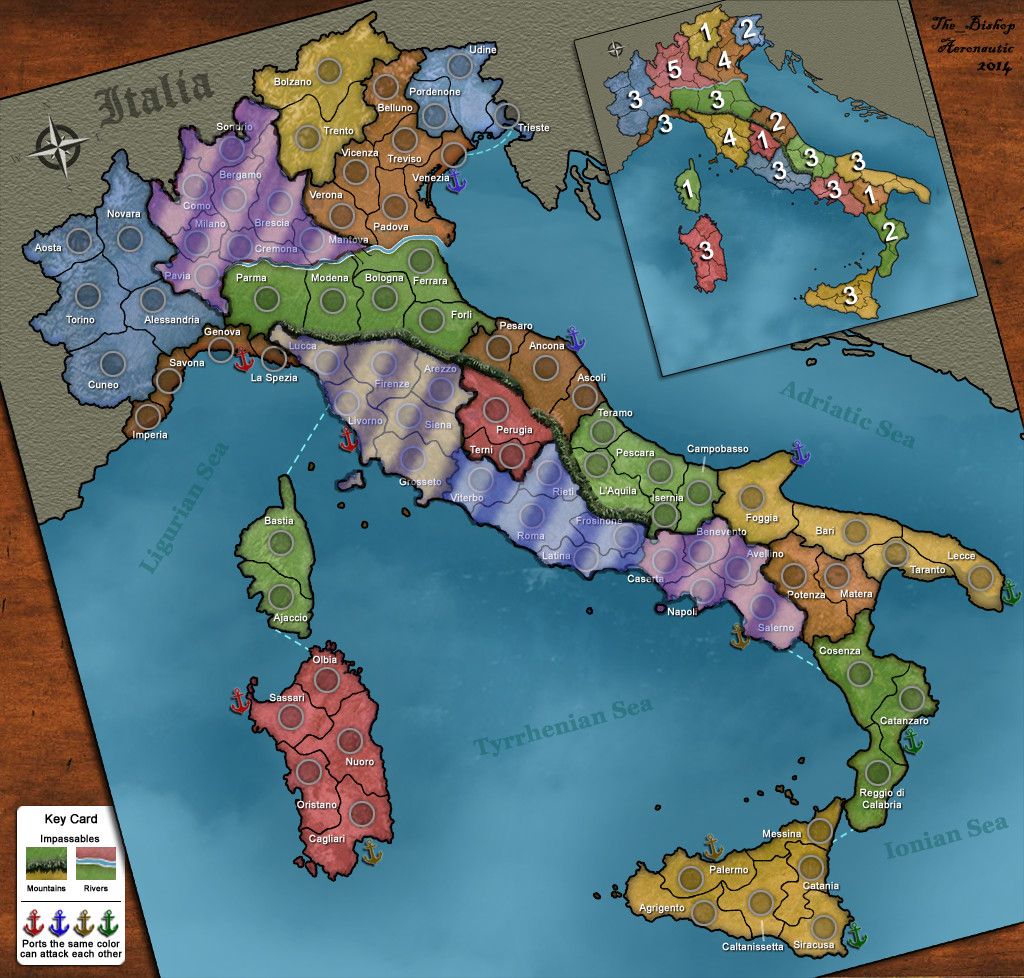
So here the map at the current state: http://www.the-inkstore.co.uk/frame/Italia_11.png
The image has been rotated to look like a real game board lying on a table, this giving a better fit into the screen. Map rotations are rarely allowed at D12 but in this case it looks like we get a special permission.
[b]<<< STANDARD GAME-PLAY >>>[/b]
It's a large size map (81 territories) with a complex shape, I would say pretty high as connectivity.
Regions are 19 having a small mean size and pretty low in difensibility, but as I said in my previous message, notice how many small regions are there. So let's look at them better:
REGIONS by BONUSES
+1 regions of 2 territories: Trentino, Umbria, Corsica, Basilicata;
+2 regions of 3 territories: Friuli, Marche, Calabria;
+3 difensible regions --- 3 borders, 5* territories: Piemonte, Emilia, Abruzzo, Sardegna and Sicilia (*6 territories);
+3 undifensible regions --- 4 borders, 4 territories: Liguria and Puglia;
--- 4 borders, 5 territories: Lazio and Campania;
+4 regions --- 5 borders, 6 territories: Veneto and Toscana;
+5 region --- 6 borders, 8 territories: Lombardia.
I consider the last 7 in the list to be hard regions, the other 12 are worthy in my opinion. Bonuses match with the Vexer's formula. As you can see Lombardy and Sicily are the only odd-balls, the others having at least one regions with exactly same conditions.
But more than that I want to invite you to take a look at the "Super-Regions"
Image: http://i1354.photobucket.com/albums/q700/Photo_Bishop/Super-Regions_zpsfaef962e.png
SUPER-REGIONS BY BONUSES:
[b]Emilia +3:[/b] just the region as it is, but it can be merged as part of the Adriatic Side
[b]"Moors Islands" +4:[/b] (CORSICA + SARDINIA) the smallest and easiest super-region with only 3 borders with a total of 7 territories, just juicy! The name come from the regional flags of these regions, or just call it "Great Sardinia" if you want.
[b]Adriatic Side +5:[/b] (MARCHE + ABRUZZO) the second by size, but here the borders are 4, so making it surely less juicy but still worthy. Notice the same conditions can be reached by conquering EMILIA+MARCHE, but MARCHE+ABRUZZO looks to me stronger, having 2 couple of adjacient borders and having the territory of Ancona an indirect difensive role on the south trough the port in Foggia.
[b]North-West +6:[/b] (PIEDMONT + LIGURIA) an interesting one, not so hard as it seems. It's true that the borders are 4, but you can easy expand from PIEDMONT to occupy 3/4 of LIGURIA still having only 3 territories to defend! So a player conquering PIEDMONT can become very dangerous! Plus Genova looks like a nice strocking point.
[b]North-East +7:[/b] (TRENTINO + VENETO + FRIULI) the last region can be the starting point, expanding from FRIULI to occupy half of VENETO without adding more borders to defend and then expand to complete the job! Just for reference, this is an historical area for real, once called "The 3 Venices".
[b]Tyrrenian Side +8:[/b] (TOSCANA + UMBRIA + LAZIO) not a very interesting one really, having 5 borders to defend it's too hard! But borders can be reduced to 4 using Roma as internal defense or simply conquering TOSCANA, UMBRIA and 3/5 of LAZIO minimizing the borders to 4.
[b]South +9:[/b] (SICILY + CALABRIA + BASILICATA + APULIA) it seems too hard to conquer, but still the borders are only 4 so not so hard to defend. But what is really interesting here is a minor super-region formed by only SICILY + CALABRIA + Lecce: this one having 10 territories and only 3 borders to defend, giving a nice +5 bonus! We can call it the [b]"Great Sicily"[/b]. Another possibility, less interesting but still worthy, is the "Great Apulia" = APULIA + BASILICATA + Cosenza: 7 territories, 4 borders, +4 as bonus.
Some super Regions can be expanded even more: "North-East" can be expanded to include also LOMBARDY and Novara so forming a huge super-region with 20 territories and 4 borders giving a +12 bonus, as well as "South" can be expanded to include also CAMPANIA and Cagliari so forming a huge super-region with the same parameters except that it has 1 territory more.
If you want you can recall them in this way:
5 smaller super regions: http://i1354.photobucket.com/albums/q700/Photo_Bishop/smallerSR_zpsc01fb896.png
5 wider super regions: http://i1354.photobucket.com/albums/q700/Photo_Bishop/largerSR_zps3b838ee1.png
The wider ones are mostly about fixed/capped games because in a standard increasing game will be hard to have the time and the power to built such big empires before the game enters in the killery phase. But also if you play it with only 5 or 6 players so having a greater reinforcement per turn, then the super-regions become more importants and the game delays more to enter the last phase.
I want also to highlight the "low-interest area" that is practically formed by the regions that are not easy to conquer, nor are part of any easy super-region. They can be nice as ricovery area when you are too weak. First of all the big Lombardia, having a role of "Asian region" in this map. (This is for real the Italian region with more inhabitants and more provinces.) And also Tuscany, Lazio and Campania being harder regions. The 3 undifensible regions in the middle aren't so bad, providing an important North-South path if not owned. Veneto also is an hard one but having a small internal region makes it much more conquerable.
Image: http://i1354.photobucket.com/albums/q700/Photo_Bishop/lowArea_zps1d799c31.jpg
So speaking about increasing games what is important is to know are the possible paths in order to stroke and kill your opponents when it's the right moment. So keep in mind the sea connections and the place where you can translate from one sea to the other trough the land.
This image should clarify: http://i1354.photobucket.com/albums/q700/Photo_Bishop/seaPaths_zps28edcf57.png
As I said it's a complex shape map!
Another important thing is where are the best locations to bunch his own troops in order to be able to stroke everywhere in the maps. I think the best stroking point should be Ancona being able to easy reach the North, the South and the West. But also Genova looks good in my opinion and also somewhere in the South, probably the best is the port of Salerno. But I am not sure to having studied them enough. The territory of Roma is also interesting for its ability to block the North-South path.
Only 3 territories are useful "prisons" to protect an opponents, lets call them semi-deadends having only 2 ways out (adjacent each other). Those are Imperia, Aosta and Trieste. As I said the connectivity is pretty high in this map.
To resume what I said in an image: http://s1354.photobucket.com/user/Photo_Bishop/media/details_zps2cb6bf6b.png.html
[b]<<< CAPITALS >>>[/b]
I tried to make the map as good as possible for capital games, so having many territories inside the region with at least 3 ways out, that is also a reason that you cannot find any regions with less than 3 borders except the smaller ones.
So here my proposal as capital: http://oi62.tinypic.com/16ii58y.jpg
2 caps: Firenze and Napoli, both having 4 adjcences. I liked this placement for having 3 different and completly detached paths between one cap and the other. Giving 40% odds to each player to have one free path against his opponent (3*0.67^5 = 0.395).
Not very interesting for standard games to play 2 caps in this map, but it can be worth for same-time games.
http://i1354.photobucket.com/albums/q700/Photo_Bishop/Italiy_2caps_zpsfcb049f5.png
3 caps: Firenze, Pescara, Caltanissetta.
Equal 6 hops paths. Still a setup mostly for same-time games.
http://i1354.photobucket.com/albums/q700/Photo_Bishop/Italiy_3caps_zps145ca17d.png
4 caps: Torino, Padova, Roma, Caltanissetta.
Always 6 hops paths with 2 little exceptions. Still a low number of players.
http://i1354.photobucket.com/albums/q700/Photo_Bishop/Italiy_4caps_zpse9cdb2f9.png
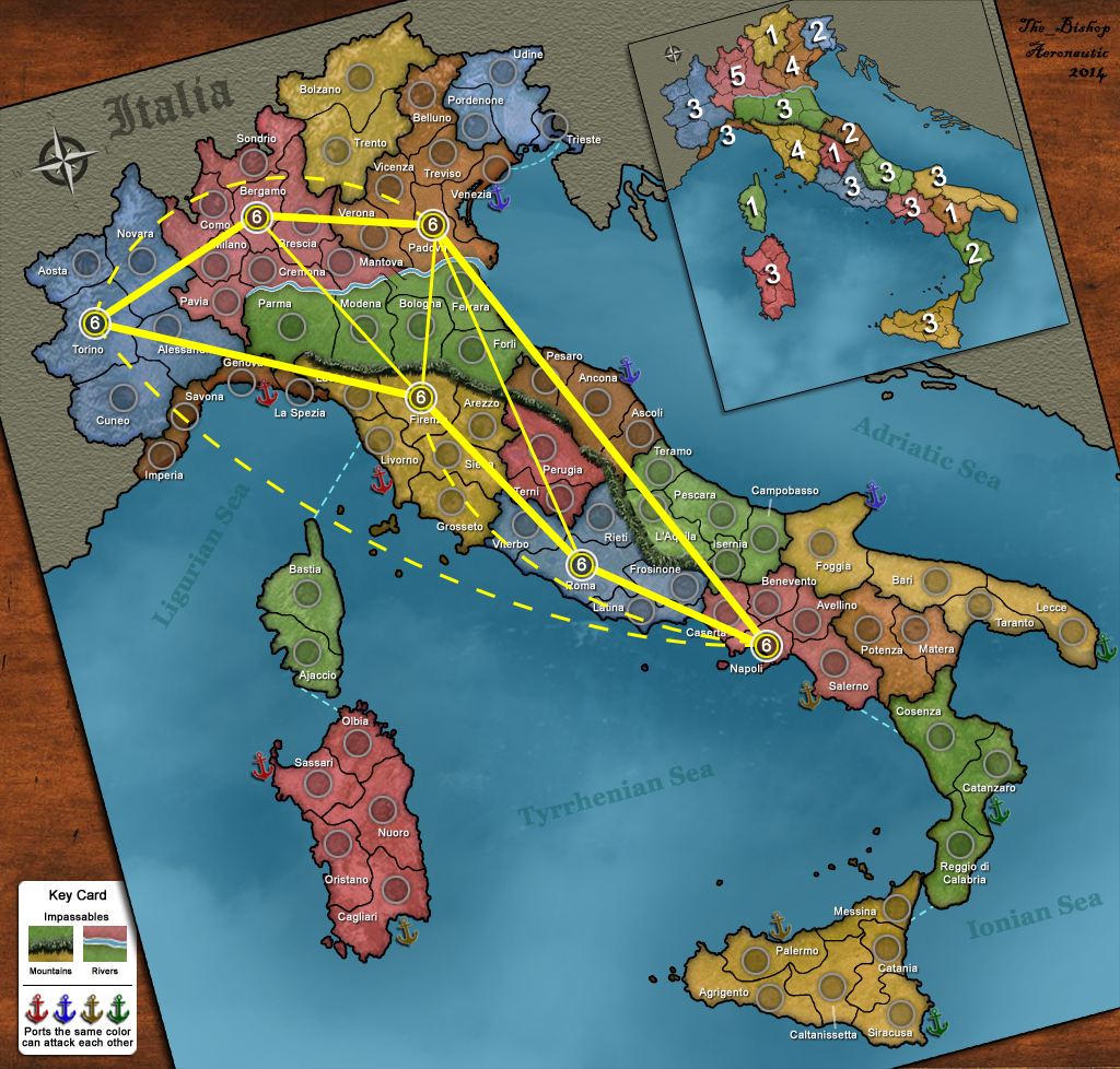
5 caps: Torino, Padova, Firenze, Pescara, Caltanissetta.
The paths are traced in the image, the thick ones are 4 hops, the thin ones are 6 hops.
http://i1354.photobucket.com/albums/q700/Photo_Bishop/Italiy_5caps_zps6fc94512.png
For 6 caps and higher...
the thick lines are short paths (3 or 4 hops),
the thin lines are medium paths (5 hops),
thin dotted lines are long paths (6 or 7 hops), just when it seemed logical to remark them.
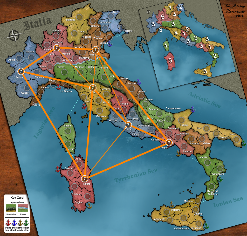
6 caps: Torino, Bergamo, Padova, Firenze, Roma, Napoli.
A standard hexagon of short paths, plus some diagonal (medium or long).
Torino and Napoli are a tiny bit unfavourited by the paths.
http://i1354.photobucket.com/albums/q700/Photo_Bishop/Italiy_6caps_zpsd9ec7541.png
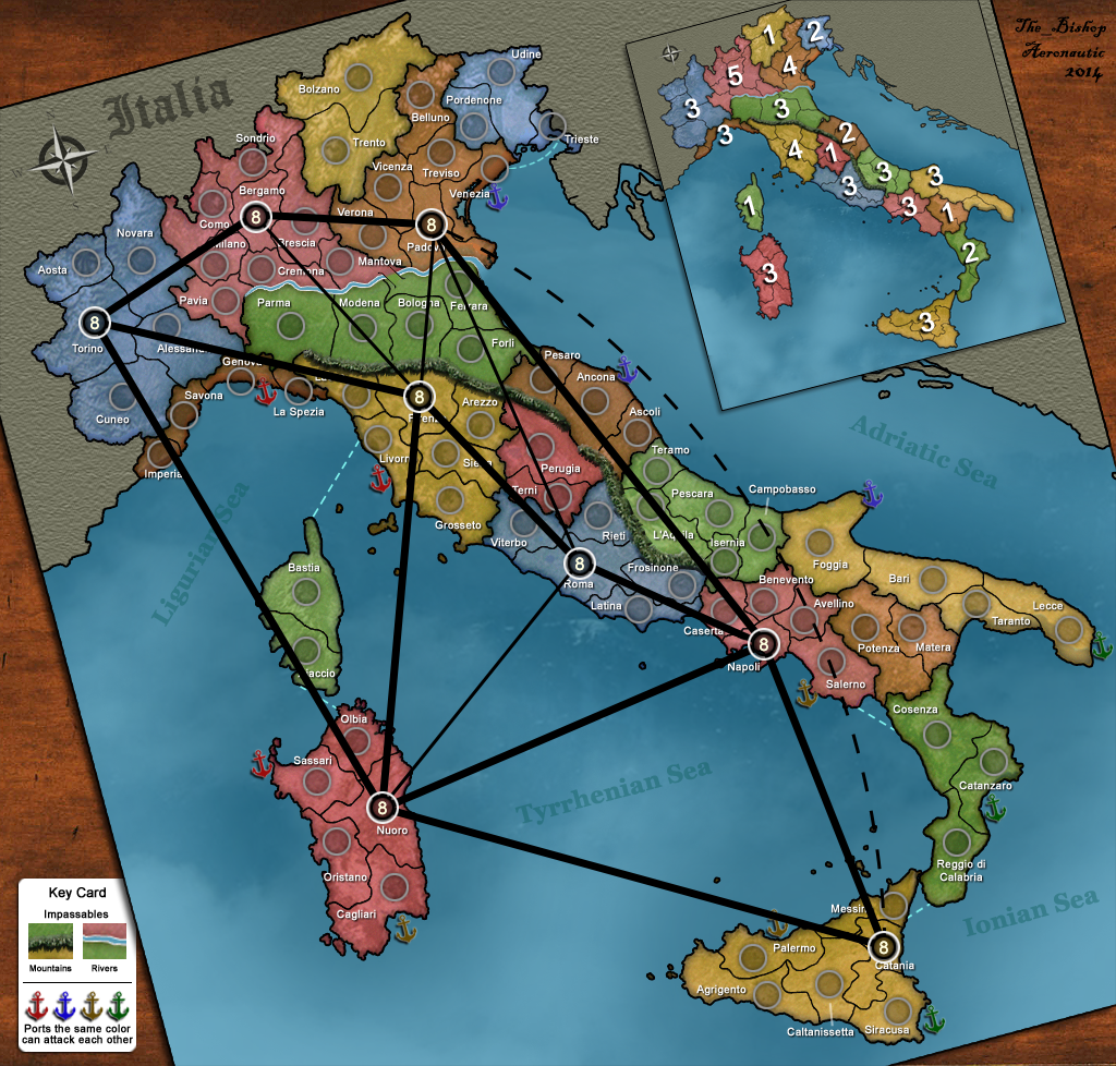
7 caps: add Nuoro.
It seems to be super good for its vicinity with many capitals, but notice the self-blocking path trough the port of Livorno so that we can say this capital has only 2 ways out and half, instead of 3.
http://i1354.photobucket.com/albums/q700/Photo_Bishop/Italiy_7caps_zpsec5da36b.png
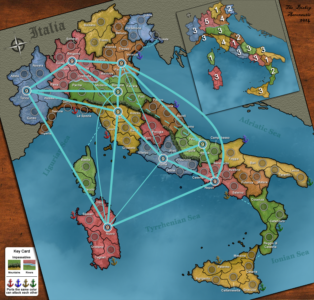
8 caps: add Catania.
A bit apart from the others having only a long 6 hops path to Venezia as third option, but it doesn't look to be a great disadvantage. By the way the 8 caps is the most beautiful placement, the one that fill better the map.
http://i1354.photobucket.com/albums/q700/Photo_Bishop/Italiy_8caps_zpsfa06a0e1.png
9 caps: Torino, Bergamo, Padova, Bologna, Firenze, Nuoro, Roma, Pescara, Napoli.
Similar, removing the Sicilian cap, adding Bologna and Pescara. Unfortunately they are not close enough to have a decent path. By the way every cap has at least 3 short paths and not more than 4. Pretty balanced!
http://i1354.photobucket.com/albums/q700/Photo_Bishop/Italiy_9caps_zps7fe280af.png
[b]<<< REFORMS >>>[/b]
So here would be the place to discuss the amendements proposed mostly by Vexer and Matty. I know the importance of the difensibility in order to have a nice game-play. Here really I tried a different way based on many "little and easy" regions and some "large but not so hard" super-regions, this giving the possibility to have a map that is good both for Deathmatch and Capitals. If I make for example a comparison with NYC map, then my regions look a bit more difensible, but still I played plenty of good games in NYC map. I can understand Vexer's thoughts, probably he realizes that in a land of such a shape as Italy we could get a game-play much more close! But well, these were my feelings when I planned this map and now... I am not in the mood to change everything! Then everybody can see things in a different way and so we will be never all on the same line. But still I think that Matty proposal is pretty suitable. So moving the green ports to Reggio Calabria and Taranto (instead of Catanzaro and Lecce) and at the same time removing the connection between Venezia and Trieste as proposed by Vexer. It is a little reform that doesn't change so much the whole game-play nor the capital placement. But if you ask to me, I vote for no changes. It seems to me that this reform ruins the equilibrium in the region bonuses, and I don't think that every map must have a super-easy region to conquer in order to propel the fight. Here I searched more a sober style. Plus those territories are parts of the super-regions that I described, so that, in my opinion, they are already interesting as they are and I don't know what is the result of making them easier. A part from that I evaluate as positive for the game-play to add some more dead-ends territories, especially in the South, but this is a minor feature for me. So here I present the Italy map in this way according to my design, then you can propose any change that you think can be improving... More heads can do better than one, of course!
[b]<<< GRAPHICS >>>[/b]
I want to send a great THANKS to Aeronautic for the job he has done. He has been very precis and meticulous on doing that. Duplicating the bounderies from a real map and fitting tags and circles in such little places, using a suitable font, small but well readable. Because as you can see there are a lot of "ocean" in this map, so being a bit hazardous to make it with 81 territories! I had personally under-evaluated this problem but he menaged it very well. I couldn't do it by myself. So I want to encourage Aeronautic to finish this job that is taking more time than predicted.
The color scheme that I like better is the Italia_11, the one that I used in this post. By the way the new mountains and anchors look better than before. I am also proposing to add some objects on the board to make it more realistic and funny, something like cards and dice. I had sent an e-mail to Aeronautic for that, but maybe it's better to discuss it in public.
Something like that: http://i1354.photobucket.com/albums/q700/Photo_Bishop/Italia_11_modified_zps69ff7b66.png
What do you all think? It's amazing beautiful for me, but maybe you think it's weird. Let me know please.

![[image]](http://www.the-inkstore.co.uk/frame/Italia_11.png)
![[image]](http://www.the-inkstore.co.uk/frame/Italia_12.png)


![[image]](http://www.the-inkstore.co.uk/frame/Italia_13.png)
![[image]](http://www.the-inkstore.co.uk/frame/mountains.jpg)