Fantasy Realm by Vexer
  • 48 posts
  • Page 1 of 4
Vexer wrote:
This is a continuation of the Example First Post thread.

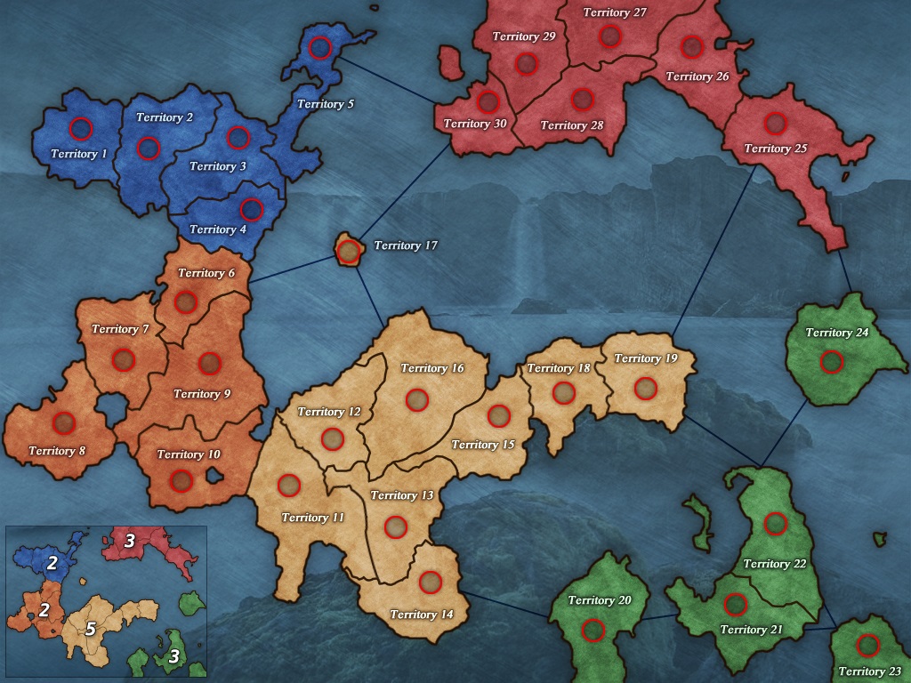
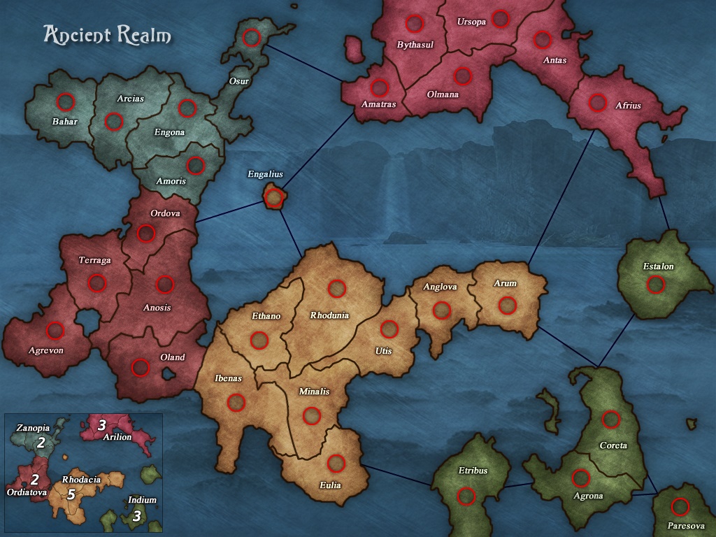
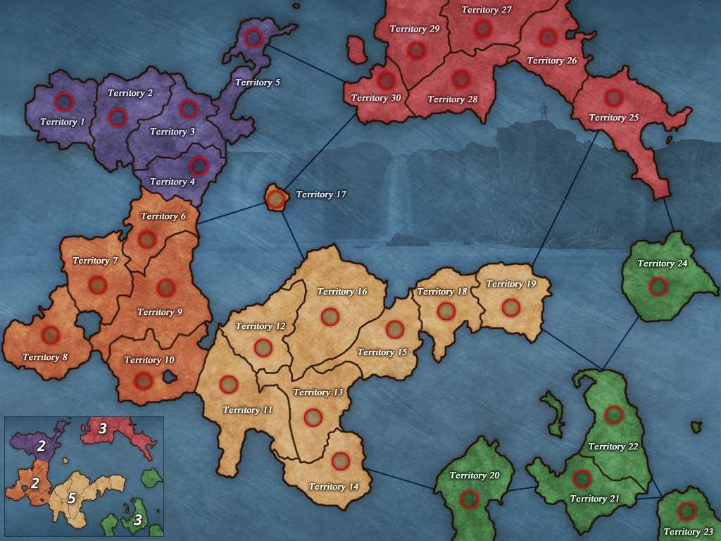
I can remove the background image if you guys think it's weird or wrong. But Glanru and I like it.

I have yet to think up a good title for the map and picking out territory names will be a chore.

I probably also need to adjust colors and contrast a bit. I'll need to look at it again in a few days with fresh eyes.

What do you think?

http://dominating12.com/assets/img/forum/Map_Creation_Forum_Images/example3.jpg
Matty wrote:
I like the idea of a background picture like that. The problem I have with it is that it looks like you look at the bottom most rock from the top, where you look at the waterfall from the side.

Blue can use some more contrast with the background I think.

I usually like dashed connection lines better.
Looks nice!
"Strength doesn't lie in numbers, strength doesn't lie in wealth. Strength lies in nights of peaceful slumbers." ~Maria
-NoXoN- wrote:
This is lovely map. I like colors but blue, maybe you can try to replace it with purple or something like gray. Is working as it is but maybe it can be better.
 Im jealous about background... definitely unseen
Vexer wrote:
Ok, I am not stuck on the blue, actually I didn't even try to change the colors much from the original so I should spend some time on that.

Does anyone else have a problem with the connection lines?

@Matty this is an actual photo of the waterfall of the gods in iceland (aka Goðafoss) so I'm not sure why it looks like the rocks have the wrong perspective to you. It looks fine to me but I have seen the original without the blue over the top. I have thought about deleting the rocks and only having the cliffs.
Thorpe wrote:
The problem is that you are looking down at the map and your background you look at the side of it.

The Colosseum map works cause you have it on top and all angles are the same.

I would go for the land in more of a 3d look if you wanted the waterfall.

I am working on a map that some if the land is under water and it looks cool ...but still looking at gameplay.
95.5% of the time you kill a players cap before your 2nd turn in... you fail or die next
Leedog wrote:
It's a Vexer map, so of course it's going to look good!!

But I feel, in my humble opinion, it lacks that wow/cool factor.

I'm sure all the map makers here have thought about an area of the planet and if it could be turned into a map... but where is the "wow" factor? Is someone going to come up with a map of Rhode Island, just because a map of Rhode Island hasn't been done yet?

Sure, good ideas just don't fall off trees but when is enough... enough? How many maps of unknown or irrelevant areas does the website need?

I don't think history is being utilized enough. Glanru created a map about western trails but I ask... are people really going to gravitate to that theme/concept?

The website has no World War I map, World War II, Iraq War, Afghanistan War, Civil War, Revolutionary War, Map of Pakistan showing location of Bin Laden...

History and mankind's greatest wars have been forgotten... and Risk is about War isn't it??

If I'm wrong and more people feel it's about domination... then who would want to dominate a map such as ... Rhode Island??

Every map maker here has a map with the "wow" factor and I have total confidence you can all do it again... if you're up for the challenge??
Matty wrote:
Its no real problem, but its just that the bottem most rock looks af if you look at it from the top, which feels a bit weird.

Curious how it would look without that rock (or without both rocks)


And leedog, this map has a nice gameplay, it has a nice feeling over its looks, and that background really makes me wow a little bit.
So I dont know howmuch you want from maps, but if you want to make each map more than 100% perfect you might as well want to accept that its not going to work.
Ok, its a made up world, so what? I love world of Tor, and that one is completely made up as well.
"Strength doesn't lie in numbers, strength doesn't lie in wealth. Strength lies in nights of peaceful slumbers." ~Maria
Vexer wrote:
ok so here is what it looks like with a purplish color instead of blue and without the rocks.

Not sure how to respond to leedog. I think it will be better once I have a theme with a title and territory names.

http://dominating12.com/assets/img/forum/Map_Creation_Forum_Images/example3_purple.jpg
Cireon wrote:
Why is there a man on the cliffs? :P

Well, the rocks kinda work. However. When I look at the bottom half of the map, the background seems flat and normal. Then, suddenly, cliffs! I am not sure how to make this work, it just doesn't look right for some reason. It looks okay when you look only at the bottom half of the map, it looks okay when you only look at the top half of the map, but they don't seem to connect together nicely.
“This is how humans are: We question all our beliefs, except for the ones that we really believe in, and those we never think to question.”
- Speaker for the Dead, O.S. Card
Vexer wrote:
I'm not sure yet why there's a man on the cliff. I'm still working out a theme and just put him up there for fun.

I also thought the map is unbalanced now and I have some ideas for the bottom half but haven't had any success getting it to look right.
Matty wrote:
It looks nice this way I think. Not sure about that man either. Colour is fixed this way.
"Strength doesn't lie in numbers, strength doesn't lie in wealth. Strength lies in nights of peaceful slumbers." ~Maria
Vexer wrote:
Well, I was supposed to be doing other things this weekend but got stresses out and started working on this map again instead.

I know leedog still won't be impressed because it's all made up and there's no real history here but I'll save that for another map. This map was simply a continuation of the example map and it is what it is. I am not ignoring his post, I will keep what he said in mind for future maps. But for this map there is nothing that can be done to it to please him.

I hoped I solved the rock issue with new rocks. I also hope that the new colors don't create a new problem. I think they look much better. Dragons are ancient so I think it fits the title. I know it's not the best dragon but is it good enough?

http://dominating12.com/assets/img/forum/Map_Creation_Forum_Images/ancient%20realm%20risk%20map.jpg
marcoxa wrote:
first off i love the new shading for the land, very nice. colors are a nice improvement as well. names are nice nothing wrong there. i am not sold on the background image yet but i like it better than the last update

speaking of the last update, what i normally do when comparing updates to their new ones is i open the last update in a tab then open the new one in another tab. the i switch back and forth from them. and do you now what i noticed? the man that was on that cliff looks like he transformed into this bat like creature, is he like a vampire or something? O.o whatever it is i don't know if i like it, to distracting.
BrewDog wrote:
Its an angel. He/she/it just opened up their wings and is ready to take flight. If that is a dragon... it needs to be spitting fire down the cliff side. I do like the back ground. Its nice having an actual picture of something back there.
Leedog wrote:
Textures and colors look great, but have to agree with the others on the "dragon"... kind of looks like a demon.

Also, Vexer... may have pulled -Noxon- out of map making retirement to help on Pearl Harbor (sent outline already). Will talk to Thorpe on WWII Normandy Invasion map.

Trying to put my money where my mouth is by working on some War maps with the skilled map makers here.