Critiques and Opinions appreciated
  • 54 posts
  • Page 1 of 4
SethHrab wrote:
So, just playing around trying to get some insight on what things I could be doing better, ways to make this easier, etc. This is a total test map, and zero intentions of it being live obviously, but I thought maybe some more experienced map makers might provide some help on things I'm doing wrong / right, what I could improve on this map as an example for a real project in the future, so on so forth. I can edit the map of course, so it might even be a good example of something to practice editing live to give a better idea of what things I didn't layer correctly or something like that for ease of change. Basically, I'm asking to treat it like a real map (aside from obvious game play / troop count issues) and critique what you would normally critique, I could make the changes. Maybe eventually this becomes a good example for a future map maker starting out.

Apologies if this doesn't belong here.

Test Map
Hoodlum wrote:
hi seth. it's cool that your interested in it. I started off making a similar thread to learn how to make maps inbetween turns/spare time.
https://dominating12.com/forums/3/map-creation/1803/map-dabble
Feel free to use that thread if you want.

I only messed around with making gifs, and stuff before making maps, but i learned nearly everything here from the feedback of the cartography team.

I feel this is a good way to start off for anyone wanting to make a map on d12. start off with a test map with no hopeful intentions and go through the process of our feedback. make plenty of mistakes, and you'll get familiar with your paint program, and learn how to make things easier each time. You'll get faster, and soon enough you'll be able to implement things you want to do.

There is a lot information already on the site, and it looks like you may have already checked them out.

DXII Guide to Map Making

Map Tutorials & Guides

Outlines, Borders & Territories

-----
Your off to a great start with the basics.

What you did right. (commenting on basic graphics)

Dimensions are good. 1024 width and 600 height. Best maps are the ones that fit the screen with no scroll.

Minimap fits. and you have room for a title.

current colours won't clash with circle colours

There's room for circles and labels on each territory. You can download circles here. https://dominating12.com/assets/img/territories/normal-large.png

Territory count (24) falls within the correct range

---
What you could do better.

Have a different thickness between Border, Outline.  Border slight smaller.

Add labels or something temporary like numbers to each territory so we can communicate better with feedback. Also put your image in a spoiler like this, so we don't have to go offsite. eg:

Test Map (click to show)

Basic fixes needed (click to show)

----
What you could do next.

edit Basic fixes.
Add a title.
Add a frame. (not necessarily needed, but good practice)

----
Some Extra Gameplay tools.

This is a video i made with links to download a map editor program, and create your own risk game on your PC. Your map is already good to go, to test out gameplay. This is good satisfaction, if you want to put all those hours of practice into actual gameplay.

Map editor (click to show)

d12 - Bonus Calculator

---


Warrant ☰ ★Officer I and a Gentleman
SethHrab wrote:
That's some great feedback and I'll get started as you state, primarily for the practice. Took me a minute to figure out how to do a spoiler.. thanks for making my brain work there too! :P


Spoiler (click to show)
Hoodlum wrote:
spoiler bbcode, outside the img bbcode. image link in between the img bbcode

example - i put spaces in between so you can see the code
[ spoiler ] [ img ] https://imgur.com/Rix20dR [ /img ]   [ /spoiler ]
Warrant ☰ ★Officer I and a Gentleman
SethHrab wrote:
Quick question - could you expand on what you mean about size change between border outline? I'm not sure I follow
Hoodlum wrote:
of course gameplay is the most important thing. a real location is usually always more popular. I've thought about doing a london map for a dabble., it's a basic shape like your one, but it has a river through it which can be utilized better for gameplay.
your map doesn't allow much for helping you with gameplay critique.
if you feel like starting from scratch, you could practice with a london map outline..river to help for a better gameplay..

best part of map making is the research too. looking for references to trace. and ideas for regions, place names etc.

here's a quick browse, but you could find better ones. (just an idea)

http://mappinglondon.co.uk/wp-content/uploads/2015/10/londoners_board-1024x859.jpg

https://www.londoncouncils.gov.uk/sites/default/files/Sub-regions.png

http://www.citymetric.com/sites/default/files/article_body_2017/08/londonplan.png

Warrant ☰ ★Officer I and a Gentleman
Hoodlum wrote:
SethHrab
Quick question - could you expand on what you mean about size change between border outline? I'm not sure I follow

oops. borderlines = region lines. separating regions.

Your outline, and your region lines are the same size. With your small map, it's probably not a concern, I think some map makers might even do the same.

i usually have a border line a bit thinner than the outline. 3 sizes. I don't know why I do it, but I think that's a feedback i got once lol.
Warrant ☰ ★Officer I and a Gentleman
SethHrab wrote:
Added everything you suggested (I think).

Welcome any further feedback of course!

Spoiler (click to show)

Understood now (after the update) of your meaning with outline and border. I'll include that in an updated fix if there are more suggestions.
Hoodlum wrote:
That's a good edit. fine tuning the basics now.

- i'd centre the island better. the minimap is a bit close. there is unbalanced empty space.
- you don't need the connection line in the mini map

some maps with varying shapes leave space, you can fix spaces with stuff like a compass, whales, ocean names etc. In this case you can move the island down and left a bit. That might be an annoying edit because of each layers, but that's the kind of annoying feedback you might get lol. Getting the basic structure right at the start will save a whole bunch of time later.

add some ocean labels while your at it.

*You've already got texture and stuff. I know I do this with my dabbles, but it's advised to start out with just the basic colour fill for land and ocean with the other dimension to present the map. The creative stuff comes last after the layout, and gameplay is sorted... doing the texture stuff early may waste a lot of time later if you have to keep editing everything used.
Warrant ☰ ★Officer I and a Gentleman
aeronautic wrote:
Wow, I go to sleep and wake up to find a new map maker has arrived and Hoodlum has almost trained them! ;)

@SethHrab This is exactly how I would expect a first draft of a map to appear, even from an experienced map maker.
You seem to have the right approach, patience and temperament to make maps, so stick at it.

What program are you using?

When making a D12 map:
My #1 tip is to make things easily editable, as you WILL be editing almost everything from the feedback.

Always wait for a couple of people to comment on any posts that need feedback, or you'll just get one person's opinion and not necessarily a constructive opinion.

You'll be able to tell what's constructive and what's just Blah, when the feedback includes suggestions, details and/or sketch examples or even offers a graphic layer done for you to use.

Making a D12 map will usually take you through 4 phases.
1) Find out if there will be any interest in the map, location or theme via Map Suggestions (start / don't start).
2) Game-play set up (use sketches or simple map drawings to set this up and adapt it with feedback from veterans).
3) Create the graphics (make the outline, borders & dividers, add texture, colours & overlaid graphics).
4) Refine all the images, text and layout until it's ready for D12.

---------------------------------------------------------------------------------------------

Keep practicing on your test map, you'll get loads of tips and advice and we'll get to know your graphics capabilities / prospects.
When I first made a map, I knew my way around Photoshop, but never knew anything about what goes into making a Risk game map.
We all learned by mistakes as Hoodlum stated and we still make mistakes or try things that don't work, it's the best way... "to err is to be human".

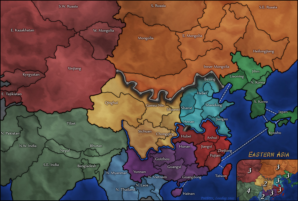
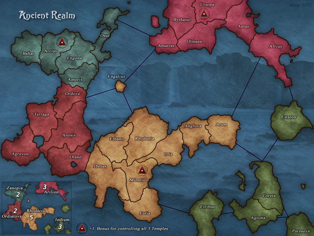
Observation: The random test map looks just like a fly with folded wings.
Observation 2: Your territory names are very funny, I see what you were seeing in their shapes.
Hyd yn oed er fy mod Cymraeg , dim ond yn siarad Saesneg, felly yr wyf yn gobeithio y bydd y cyfieithu yn gywir.
Cireon wrote:
The map looks better than what I could ever make, so great job.

I am not a graphical expert, so I will comment on some of the gameplay if you don't mind. Right now, the map is a bit blob-like. This is visible in the high region bonuses. There aren't a lot of obstacles to give the map cool geography. This can be a style choice, but it doesn't really make for the best gameplay. Some good examples of maps that use geography or East Asia, Texas, and Iberia. There are also maps who get away without it, such as Europe and Dominican Republic, but in those cases you have to be more careful with how you draw territory lines. It's much harder to find examples of the latter.

In this particular case, I would rethink the dashed connection lines, because they are not very logical to me and add connectivity to an already very connected map.

I think if you would add some geography to make the topology of this map more interesting, it's a great candidate for a good duel map. I am thinking of a map that can join the likes of Ancient Realm, Caribbean, and World Reduced.

I will leave you in the very good hands of our map makers. It's great to see more people willing to learn about the art of Risk maps. Always welcome to help with more feedback if needed!
“This is how humans are: We question all our beliefs, except for the ones that we really believe in, and those we never think to question.”
- Speaker for the Dead, O.S. Card
Matty wrote:
Small comment from me:
The graphics are good. I'd say this even if you were an experienced map maker. For a first map, wow, well done.

The gameplay is not that much fun I think. It's a small map, so probably played with few people, but none of the regions is very good or easy to take.
Nothing really in this map to fight over, except getting territory numbers.
A region of 7 territories is considered a big region, and you have 2 of these (and one of 10). It's fine in a big map to have a few of those, but in here it's the only regions you have.
Apart from that, most territories on this map are borders, which makes a region hard to defend.
"Strength doesn't lie in numbers, strength doesn't lie in wealth. Strength lies in nights of peaceful slumbers." ~Maria
SethHrab wrote:
OLD
Spoiler (click to show)

UPDATED
Spoiler (click to show)

@Hoodlum - most of what you suggested is done, thank you for the headache of editing texture... lesson learned there lol. The only thing I didn't do was the outline bigger than the region borders as earlier suggested.. For this map I just don't see it's necessity, but I get your point for future maps with more territories, regions, outlines. In my opinion it looks cluttered now with the narwhal and compass both.

@ aeronautic I am using paint.net - admittedly, I have limited experience besides a random dabble here and there in editing photos (i.e. my wedding photos my wife had a strand of hair covering my forehead). On all fronts, excellent points. I see the value in multiple replies. Beginning to edit this map, I see the value in making things easily editable.. what started as 4 or 5 layers is now getting closer to 10-15! Glad someone else appreciates my humor. :)

@Cireon I eliminated the sea connections, I agree it was too much, mostly I just had that layer to show that I could add that to a map for myself. I don't intend this map to be playable, so yes, there are massive gameplay issues. In regards to geography - this is an area of weakness for me. I would LOVE some suggestions here or even links to simple transparent mountains/trees/walls/etc that I could incorporate into future maps.

@Matty Thank you for the compliment! Agreed that the gameplay is pretty horrible. I had a thought for about 5 seconds of separating the regions some and making them individual continents, etc, etc but that would be a lot of effort for a map I have zero intention of ever being live. A real project I would do this of course, and probably spend a lot more time than usual contemplating and receiving feedback on and updating according to gameplay concerns. Not for a trial run.. call me lazy, it's true lol

Thank you all for the feedback. I do have a couple real projects in mind, but I'd like to get some more tips on things that I lack here graphically. In particular the geography side of things Cireon points out. Aeronautic, I know from looking at Atlantis that you are exceptionally artistically developed in this area as well.. any thoughts / links / suggestions for a novice? I'd love to be able to make a beautiful map with trees, mountains, walls, etc. Something that -looks- like a very well drawn map, or more "real" if you will.
Hoodlum wrote:
Good Job!

Cool. I use paint dot net, so it'll be easy to give you tips with that too.


When making d12 maps, you'll get to know what each specific critic likes/dislikes.
Sometimes one likes it, the other doesn't etc. You'll hope for the easier edit, but a lot of time it's going to be the painful edit, haha.
When i make maps now, I've got the team visually in my head picking it apart before I even show them.

I remember when I first started, i told myself to just don't do stuff I think looks good, because i'm wrong lollll. But I look back at some
of the maps I've made, and it baffles at how it ended up. So they are right.

agree with aero, that you have the right temperment and patience for this.

edits. easy ones

aero (in my head) tells me that the sea labels should be the same colour as the ocean, just a lighter colour though. I remember this advice when making Australasia map. eg https://dominating12.com/assets/img/maps/68.large.jpg 

move some of the labels/cirlces to work with the territory better. We have capital game modes, so you'll need to consider the slightly larger white rings they have which you don't want covering text/lines etc. https://www.the-inkstore.co.uk/map_resources/Circles/aero-caps-large.png
** not all territories require capitals space. but it's a good thing to remember with label placement.

organizing layers. you'll end up with a whole heap. but here's a time saving tip for PDN
PDN isn't great for text. You can't really edit a spelling mistake. You just have to do the whole label again. BUT...you might have forgotten what font
you used!! You might have a lot of fonts that it's hard to find. TIP - Naming your text layers. Add information of Font style, maybe sized used.
When you log out of PDN, it doesn't remember
 

Warrant ☰ ★Officer I and a Gentleman
aeronautic wrote:
I would LOVE some suggestions here or even links to simple transparent mountains/trees/walls/etc that I could incorporate into future maps.
Here's a link to our Tutorials & Guides page.
Tutorials & Guides
I have been saying for years that I intend putting transparent Mountain & Tree Kits in the Tutorials & Guides, but still haven't found the time.

I can always make you some as and when you need them and post them as a transparent PNG.

In Hood's post above, for the transparent circles, you need to save them not copy them, or you'll get a black background.
Then open them and copy them into a new layer, after which you can cut/copy and paste / duplicate them as many times as you like.

You will have far more tools and graphic techniques at your disposal if you use Photoshop.
There is a free version available, I'll edit in the link and instructions in a spoiler below.
Photoshop (click to show)
Hyd yn oed er fy mod Cymraeg , dim ond yn siarad Saesneg, felly yr wyf yn gobeithio y bydd y cyfieithu yn gywir.