Redone- Please comment.
  • 53 posts
  • Page 2 of 4
Vexer wrote:
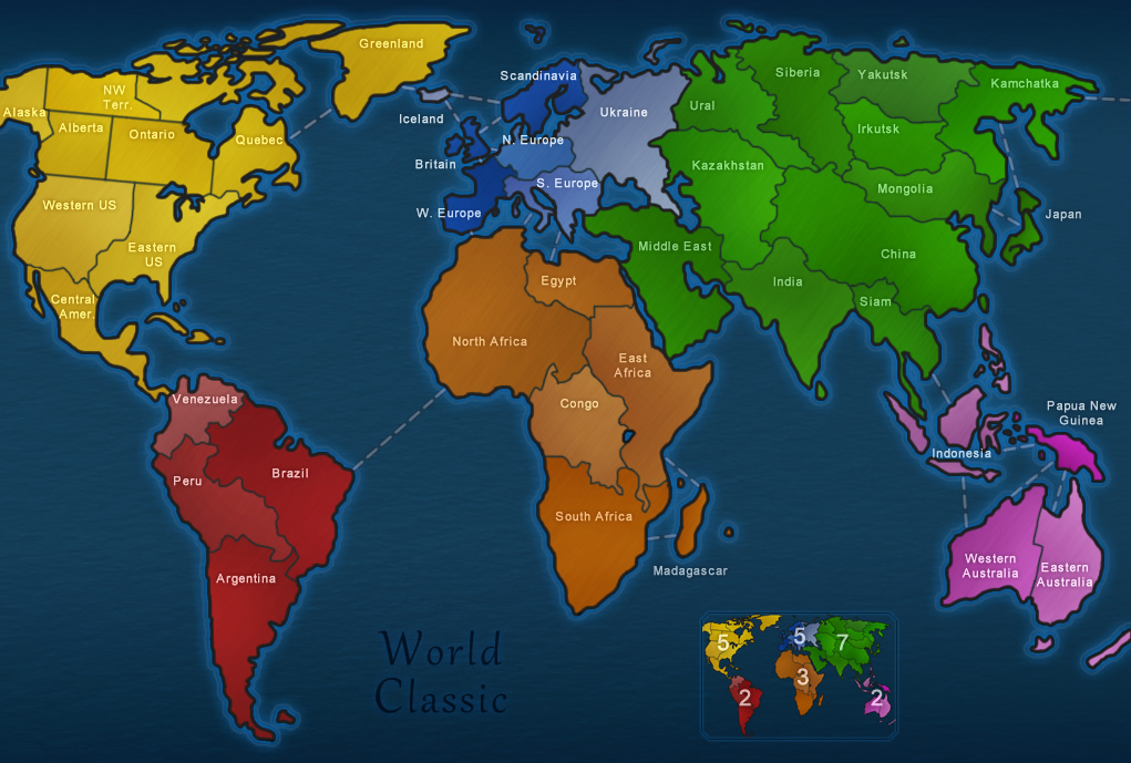
So Fendi and I decided to reuse the same style on the World Classic update since so many people are so fond of it. We can save the other style for the modified world maps we are going to make.

We think it's done so unless you speak up and comment, this is what you are going to get. Please comment even if it's the smallest thing. We want this map perfect.

If you want to try to improve some aspect yourself then send me a message.

New Version:
https://dominating12.com/assets/img/forum/Map_Creation_Forum_Images/World%20Classic.jpg

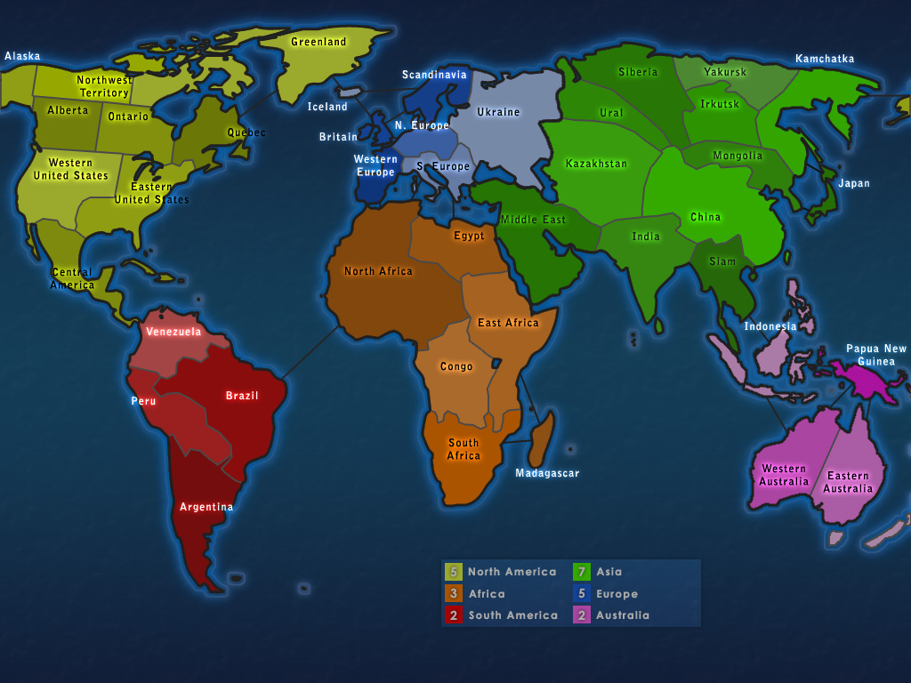
Old Version for comparison:
https://dominating12.com/assets/img/forum/Map_Creation_Forum_Images/1.large.old.jpg

(Edit by aeronautic): I have put the new addresses in for the above images.
Thorpe wrote:
very nice!  Text is great and the territory lines are a lot better..looks more like real territories now.

Just a cleaner and better looking map without changing the over-all look of the map!

You guys out did yourself...I know how much you wanted to change the whole look of the map and you had to turn that "want" off, but still make it to the standards that you have!

Great Job!!
95.5% of the time you kill a players cap before your 2nd turn in... you fail or die next
Thorpe wrote:
But that pink is too bright and doesn't fit with the rest of the map..bring down the saturation on the one territory and then it will work
95.5% of the time you kill a players cap before your 2nd turn in... you fail or die next
Vexer wrote:
yeah you're probably right. fendi just copied the colors from the old world map then my shading layer modified it. i'll adjust it a little tomorrow.
Pntbttr wrote:
I think it's amazing! I think you could change the color in the yellow region...maybe less saturation...
Votazap wrote:
Nicely done i love the text for the most part but its a little off in the yellow area, if the territory circles interfere i think you should change it to a different color. But great job guys!!
Matty wrote:
I really like the new map.
I just don't know if you should use abbreviations like "Central Amer." and "NW Terr."
I mean, Abbreviating North with N is completely ok, but "Amerika" with "Amer" looks really stupid (imho)

But everything else is really an improvement!
"Strength doesn't lie in numbers, strength doesn't lie in wealth. Strength lies in nights of peaceful slumbers." ~Maria
Leedog wrote:
Looks great! The only thing I would add, is the numbers in mini-map seem average or bland.
Dsds7292 wrote:
Make Africa 4, and add a connection between Western Australia and Madagascar. Other than that, It looks great
Votazap wrote:
Ds,sorry but those connections are not going to be made(at least i heard?) and africa should stay 3
Fendi wrote:
Hello.

You heard correctly votazap, we will only change the graphics and not the game play.

Thank you all for the comments, but we need more! =)

Take care.
-NoXoN- wrote:
maybe you should change color of title and spend some more time with mini map.
Vexer wrote:
Ok, modified color for yellow region and pink region. removed the abbreviations for the text. Modified the text on the mini map. Couldn't figure out how to make the text in north america better. Couldn't improve title or mini map - i'll let noxon give that a try.

Also changed the outline here and there and fixed the glow a bit. Fixed some shading and some random pixels in the wrong spots.

https://dominating12.com/assets/img/forum/Map_Creation_Forum_Images/World%20Classic2.jpg
Votazap wrote:
Big improvement but please make the glow around the map brighter thanks ;)