What your first post for a new map should look like
  • 17 posts
  • Page 1 of 2
Vexer wrote:
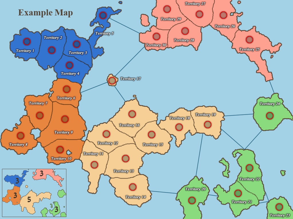
This is a completely made up place. Because so much of the map is ocean I decided not to cram a bunch of territories on it and make it a small 2-3 player live game map with 30 territories.

I have intentionally not put any effort into the graphics because I want the game play to be evaluated and commented on before I go forward with the map. The lines are rough and not carefully drawn. These will not likely be the final colors. I picked them quickly.

Does the map have the right connections? Are the region bonuses correct? Are there any modifications that can be done to make it better for 2-4 player caps?

https://dominating12.com/assets/img/forum/Map_Creation_Forum_Images/example.jpg
Vexer wrote:
This is intended to be an example of how to start a map. We have had too many maps made lately that get the graphics mostly finished without the game-play getting evaluated. A lot of effort and time gets wasted because graphics have to be redone when the game-play changes. It's not just the time of the map maker that we need to consider. The commenters are also potentially wasting their time. For example they could spend a hour all together writing several posts on the looks of the map and then the map ends up getting scrapped because it doesn't make a good risk map.

Map makers should not be moving forward on maps until the game-play has been commented on by multiple people. If you present a map like this one that has no style or texture then the community will be forced to comment on the outline and connections.

They will also be more likely to be honest and tell you that the theme or game-play is uninteresting or awful and that you should abandon the map. If you put too much work into graphics then people won't feel comfortable telling you that your map doesn't make a good risk map. If you care about your time then you'll appreciate being told upfront that you are wasting it.

Your first post on a map should have:

- Outline
- Territories
- Territory Circles
- Territory Labels
- Regions
- Connection lines (if needed)
- Title
- Mini Map

The territory circles are required to make sure that your territories are large enough. The territory labels are required to make it easier to discuss the map and so that accuracy can be checked. The title and mini map are required to make sure that you design a map that leaves space for them in order to make sure that they aren't crammed in after the fact.

If you can't figure out the region bonuses then leave them blank and ask for help.

This map was intended as an example but you are welcome to comment on it. If there is interest then we can find a 'painter' to make the map.
The_Bishop wrote:
Wow, I think you are absolutely in the right way, General!

I will comment your Example Map soon (=tomorrow)... I'm really tired now!
I think some territory names (or numbers) are needed to easly comment on it.
«God doesn't play dice with the World» ~ Albert Einstein
Vexer wrote:
You are right. The map needs territory labels to be able to properly comment on it. click on the image and refresh (hit F5). It now has labels.
Cireon wrote:
Ooh, a small map, I would like to see more of those. I also agree on your statements and think gameplay should be rated before graphics are made.
“This is how humans are: We question all our beliefs, except for the ones that we really believe in, and those we never think to question.”
- Speaker for the Dead, O.S. Card
Matty wrote:
Good example post, I think you are right about stating gamepkay goes first.


About the map:
This is a very lineair / simple map, lots of two border regions, and only one way around to get in each territory, without going through #17.
Its not as bad as carribean (I hate that map, every game you play on it is the same (Sorry Noxon, (I really like GB :))), but still not really sure.
"Strength doesn't lie in numbers, strength doesn't lie in wealth. Strength lies in nights of peaceful slumbers." ~Maria
Vexer wrote:
After seeing the popularity of the Caribbean map I thought I'd make one with a similar theme - regions that are easy to defend - but not so extreme.

Another thing to notice about the game-play is that you can push into the next region over without increasing the number of borders you have to defend - also similar to the Caribbean map.
Cireon wrote:
The bonuses of the blue, pink and orange regions are too high I think, as there are only two borders to defend. The yellow/brown one also has a bonus that's too high I think. (:

Maybe you should make a separate topic for the map itself, otherwise this topic loses its purpose...
“This is how humans are: We question all our beliefs, except for the ones that we really believe in, and those we never think to question.”
- Speaker for the Dead, O.S. Card
-NoXoN- wrote:
haha Matty there is no reason to hate map but if you hate it you dont need to be sorry. Every game you play on it is the same? Something magic.
 
 Gameplay is good Vexer so nothing special right? I hoped to see real map from you not fantasy map.
Vexer wrote:
I have a great idea for a real map but no one will let me make it because they take all my time fixing their maps. I wish our map makers would team up more. For example I didn't have to help much on the san francisco map because Leedog made sure the map was accurate and Pntbttr did the graphics.
The_Bishop wrote:
This map is good. We would need a small map with a good normal gameplay!
Saturn and Caribbean both are so weird.

I don't think there are "right" connections and "correct" bonuses. Btw here my ideas:
Blue +2, WhiteSkin +6;
disconnect 19-20 and 19-24;
connect 19-25 and 11-14;

Looking at the caps:
2p = many solutions;
3p = 9, 27, 21;
4p = 9, 27, 21, 15.
«God doesn't play dice with the World» ~ Albert Einstein
Vexer wrote:
@Cireon, This is not only an example first post but also an example of the kind of conversation that needs to go on about game-play before any painting happens. I will move the map to another thread if someone decides to paint it.

I like The_bishops suggestions so unless someone has an argument against them then I will use them. I will also take into account cireon's comment about the bonuses being too high.
Cireon wrote:
This is mainly about curiosity: why give whiteskin a +6 bonus? +5 or even +4 seems enough for me, as the region is not that hard to defend...

Also Vexer, I see your point about the topic. I hope this map will be painted, as this site needs one or two more maps like this ^^
“This is how humans are: We question all our beliefs, except for the ones that we really believe in, and those we never think to question.”
- Speaker for the Dead, O.S. Card
Thorpe wrote:
Vexer all "painters" would do it...just ask the one you would like to do it or who you would like to work with and just ask.
95.5% of the time you kill a players cap before your 2nd turn in... you fail or die next
The_Bishop wrote:
Cireon I guess you like low bonuses and regions hard to defend. Those are boring maps for me. Then nobody do nothing and the game stalemate.

By the way I perfectly agree to dim also the Orange to +2. This is much more fair.
(But bonuses don't need to be always fair!)

My personal formula is: 1 point per any 2 terries and 1 point per any border. The result is:
Orange +2, Blue +2, Pink +3, Green +3, Skin +6.

Actually Skin can be dimed 1 point, just beacuse the defendable "super-region" Green+Skin. Btw that's half the map... Better to go for kill! Since is +5 or +6 for me.
«God doesn't play dice with the World» ~ Albert Einstein