Collection of ideas for a redesigned lobby
  • 32 posts
  • Page 2 of 3
MuzuaneAskari wrote:
@marcoxa; there is a chat in the lobby. Has it solved you any problem?

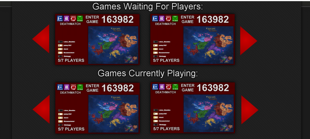
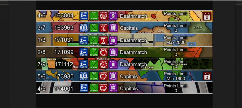
Many people are in games that don't have the options that aren't they prefer in that time, but you are not going to create another game if there are alredy 4 open with options that "are not too bad". And maybe there are 4 people like you in the same game with the same preferences. That is what I mean, more flexibility (I know it's not the proper word for what I mean) is more interesting that how it looks (essentialy, because I have no problem with the actual interface).
Gato que avanza, Perro que ladra
Matty wrote:
About this one:
http://i187.photobucket.com/albums/x2/123william123_2007/SampleLobby3_zps612e6252.png

I think you need to give up the idea of arrows, at least I would really like to see all maps at once - and that wont work with such big blocks (they might work well if you click on one liners for more info).


About this one:
http://i187.photobucket.com/albums/x2/123william123_2007/SampleLobby4_zps15d7a6c1.png

I think this one is a good start, but I'm not sure about the map over the whole length.
It looks good, but it also looks messy.
White text with drop shadow looks good everywhere, except on a messy background, which is what a map like that possibly can become.

Could you try to make the icons smaller, all text on one line, and show us a 100% image of this one?
I think if you give it the right (font) sizes you can fit the map title on it as well.

Apart from that I wonder how you do capped cards :)


@Muzuanne, I like the idea, but I think it will take ALOT of space to have a chat box per game.
It will be really hard (impossible?) to add a chat box per game, and still keep everything in one line...

Though, maybe you can add it once you expand the game for more info (like now on the LTG page).
"Strength doesn't lie in numbers, strength doesn't lie in wealth. Strength lies in nights of peaceful slumbers." ~Maria
marcoxa wrote:
i'm not sure what you mean by "messy". with this format i don't see how its possible to show 100% of the map. could you please explain to me what you mean?
MuzuaneAskari wrote:
@Matty. it's not a chat per game. The problem is that I don't know exactly what it is.

Let's say it with an example; imagine I would like to play a Cap game with increasing cards (and if posible with more than 5 players). So I would go to this new space where there would be more people who want to play Caps or Increasing; there we would take and decide to create a game with settings we all like. I keep thinking about how it could be; but meanwhile I write it here, in case somebody gets the inspiration.
Gato que avanza, Perro que ladra
Matty wrote:
@Marcoxa, Im not really sure how to explain, but maps tend to look like plains in some points, but also sometimes can be pretty full with all kinds of other stuff, like text over connection lines.
Having text (lobby) over text (map) over connections lines (map) might look bad.

That is a bit what I ment.

Apart from that, this site has a pretty clean look to it, pretty, well, spacy. Im not sure if maps as background fit in that.
But maybe they do, I havent seen them in perspective to the rest of the sites layout.


@Muzuanne, sounds like a LTG chatbox to me, but maybe a bit bigger and on a seperate page (or better: expandable box / 'popup' box).
"Strength doesn't lie in numbers, strength doesn't lie in wealth. Strength lies in nights of peaceful slumbers." ~Maria
Cireon wrote:
I might be able to make a prototype of marcoxa's design, but I am not sure if I will fully go with it. The problem is that drop shadows might not be fully supported on every browser.

I can't promise anything, because I only have two weeks of holiday left and also have to work on some other stuff which I would like to finish before the end. I still have to figure out a lot of stuff with the code on this website, so it might take me a while.

Feel free to continue posting suggestions, because changing prototypes is usually not as much of work as completely starting over in Photoshop ;)
“This is how humans are: We question all our beliefs, except for the ones that we really believe in, and those we never think to question.”
- Speaker for the Dead, O.S. Card
Cireon wrote:
Having the icons would speed up the process yes. I will send you a message with my e-mail ;)
“This is how humans are: We question all our beliefs, except for the ones that we really believe in, and those we never think to question.”
- Speaker for the Dead, O.S. Card
Matty wrote:
No of course not. Do you know how long the list will be if there are 100 games waiting for players. That's impossible.
"Strength doesn't lie in numbers, strength doesn't lie in wealth. Strength lies in nights of peaceful slumbers." ~Maria
marcoxa wrote:
not really, this proposed design is only 30% bigger than the one we have now
Matty wrote:
It looks twice as big to me, but maybe that's me.
"Strength doesn't lie in numbers, strength doesn't lie in wealth. Strength lies in nights of peaceful slumbers." ~Maria
Cireon wrote:
I am sorry, marcoxa, I did not. I haven't had any time for this since last Summer and I am still not entirely convinced about the design. The idea was to experiment with what you had and then go from there, as making changes in code is fairly easy (easier than making them in Photoshop). The visuals of your concept are alright, but I think it lacks some usability.
“This is how humans are: We question all our beliefs, except for the ones that we really believe in, and those we never think to question.”
- Speaker for the Dead, O.S. Card
True-Detective wrote:
I really like the designs in which you can see the players in the game, many times I'm looking for a game with the people I know in it.

Besides, I never want to join a same-time game, so a filter like that would help a lot. Some players only play death matches or capitals games, so it would help them too.

However I don't really think the live game lobby and the long-term game lobby should look alike.
tramadol wrote:
I have just rediscovered a confusing link for new players that has been on the Lobby Page / Welcome Page since the dawn of time...
See this thread: http://www.dominating12.com/forum/?cmd=topic&id=1559
I'm sure it is the yellow Start Playing! link. Perhaps reword this?